Your paid traffic lands on a page that tries to explain the whole business, collect every possible detail, and prove every claim at once. Visitors hesitate, scroll without direction, or leave before they understand what you want them to do.
Strong landing page best practices work as a sequence. Match the visitor's intent, state one clear promise, place proof where doubt appears, remove avoidable friction, protect page speed, measure the right action, then test one meaningful change. A dedicated landing page usually starts below a 10% conversion rate, so steady improvement matters more than a dramatic redesign. Analysis of 41,000 landing pages puts the median dedicated landing-page conversion rate at 6.6%, while 10% or higher generally counts as strong performance.
Use the seven tools below as a founder-friendly audit. You can apply the fixes before buying another platform, hiring a redesign team, or rebuilding the entire page. For ecommerce teams, this ecommerce landing page design guide adds useful design context.
1. Unbounce
Unbounce works well when you need a practical starting point rather than another abstract conversion theory lesson. Its landing page best-practices library includes a 49-point checklist, pattern libraries, setup tutorials, templates, and a Conversion-Centered Design framework built around seven principles.
That breadth helps a founder audit a page without guessing what to inspect next. The checklist covers copy, layout, forms, trust, calls to action, and mobile presentation. The pattern examples explain why a structure might work, which makes them more useful than a gallery of attractive screenshots.
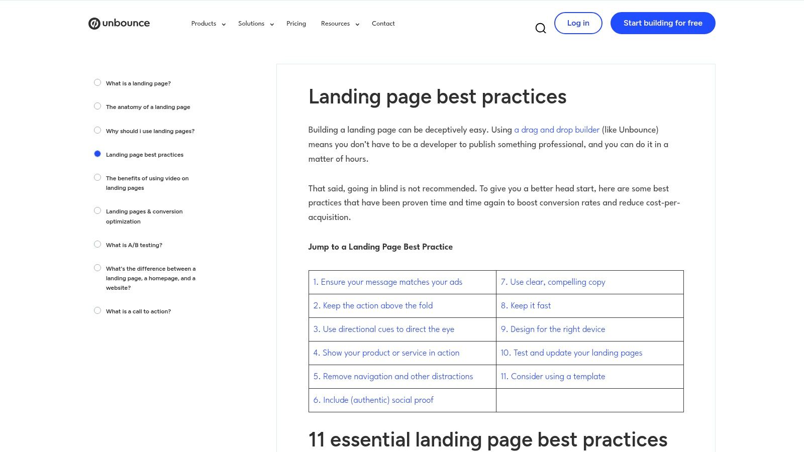
The trade-off is clear. Unbounce's content sometimes points toward its own builder, and the depth varies from one article to another. You may need to assemble your own process instead of following one complete course.
Quick audit fix
Write the promise before you inspect the design. Your headline should tell the visitor what they get and why it matters. Use this micro-template:
For [specific audience], get [specific outcome] without [main objection].
Then place one primary CTA beside it. If your page can't answer “what do I get?” in a quick scan, test the headline before changing colors or illustrations. Founders working on positioning can also use this value proposition guide to sharpen the promise.
Judge the change by whether the headline improves the primary conversion event while keeping traffic quality steady. Don't use button clicks alone if the main goal is a qualified signup, purchase, or waitlist entry.
2. VWO
VWO suits teams that want to turn landing-page opinions into testable hypotheses. Its landing-page optimization guidance brings together layout, copy, personalization, measurement, lead-generation playbooks, and experimentation workflows.
The useful distinction is its test-first mindset. Instead of saying “make the page cleaner,” you can write a specific idea: visitors from a founder-focused ad may respond better when the hero headline repeats the ad's promised outcome. VWO also connects its guidance to A/B testing, multivariate testing, heatmaps, and a no-code editor when you use the platform.
That platform connection creates a trade-off. Advice can lean toward VWO's own features, and a full experimentation platform may cost more than a lightweight page builder makes sense for a very small site. You can still use the hypothesis structure without adopting every tool.
Quick audit fix
Build a message-match test around the visitor's source. Write:
- Ad promise: “Validate your product idea before you build.”
- Landing-page headline: “Test demand with a simple pre-order page.”
- CTA: “Join the waitlist.”
Keep the audience and promise consistent from ad to page to confirmation screen. If you want a broader operating framework, this guide to conversion rate optimization for startups gives founders another practical reference.
A test deserves attention when the page currently receives qualified traffic but the visitor must reinterpret the offer after clicking. Track the primary conversion, then inspect lead quality. A higher click rate with weaker leads isn't a win.
3. CXL
A page can look polished and still leave visitors asking, “Why should I believe this?” CXL helps answer that question by examining how each element supports the decision. Its high-converting landing-page guide covers the headline, value proposition, proof, form, and CTA as connected parts of the offer.
Use CXL for a promise-to-proof audit. Start at the hero claim, then ask whether the nearest evidence supports that exact claim. A founder selling an early product may need a specific customer result, a real product screen, or a clear explanation of what happens after signup. The guide also addresses campaign-to-page message match and differences between B2B and ecommerce, so the fix should fit the buyer and commitment level.
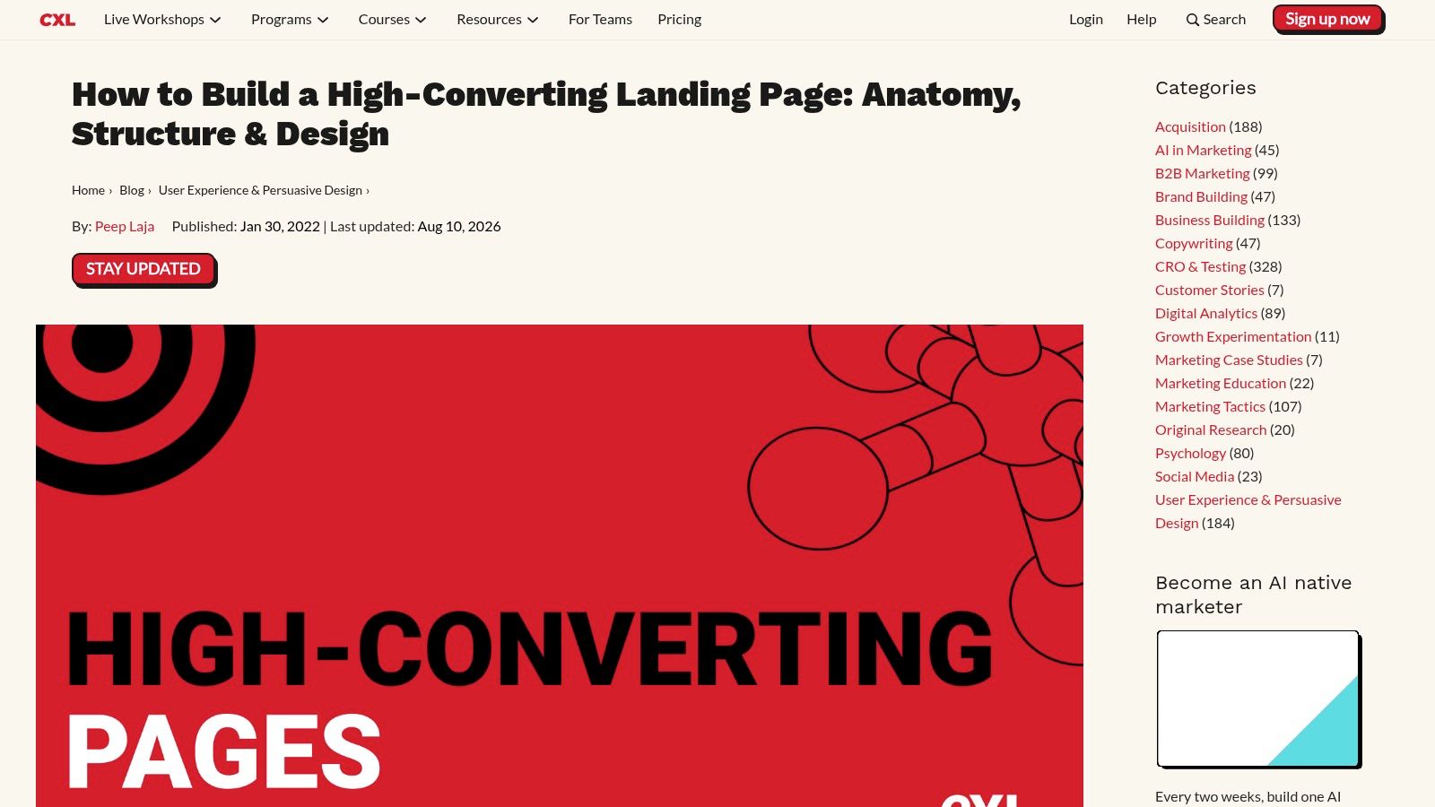
CXL's trade-off is depth. Some examples and screenshots feel dated, while advanced material sits behind paid courses. The free guidance remains useful for diagnosing clarity, friction, and proof before changing surface details.
Audit move: place proof beside doubt
Match evidence to the visitor's concern:
- Outcome claim: Add a specific result or direct testimonial.
- Product claim: Show the product, workflow, or demonstration.
- Risk concern: Explain what happens after the CTA.
- Early-stage uncertainty: Offer a waitlist, pre-order, or low-commitment next step.
Try this CTA copy:
You'll get [specific deliverable]. Next, we'll [plain explanation of what happens].
Test the change if visitors understand the offer but pause near the form or button. A short, relevant proof point beside that decision deserves a test before a testimonial buried at the bottom. Judge it by completed conversions and the quality of resulting leads.
4. Google
Google's Four ways to optimize your landing pages for conversions suits a one-day landing-page audit. It covers mobile usability, page speed, analytics, and conversion improvement without turning into a full design course.
Start with the promise, then check proof and friction. On a phone, confirm that the headline, offer, form, and CTA stay clear without horizontal scrolling. Remove any visual or copy change that makes the next action harder to understand. The PDF cites mobile speed studies from earlier years, so verify its benchmarks against current Core Web Vitals data before treating them as targets.
Use Google Analytics to connect page behavior with campaign performance. If you are new to analytics setup, this guide to Google Analytics for beginners walks through recording your first conversion event. A useful audit note is short:
- Traffic source: [campaign or referral]
- Page promise: [headline]
- Primary action: [conversion event]
- Decision: [keep, revise, or test]
A page visit is not a result. Define one recorded action, such as a completed signup or submitted pre-order, then check whether the traffic source and page promise support it. If you need a simple form workflow, compare your setup with this guide to a Google Forms alternative for 2026.
Run a test when you can see traffic but cannot connect it to a defined action. Keep the change if it improves completed conversions without lowering lead quality.
5. Crazy Egg
Crazy Egg makes the page visible through user behavior. Its landing-page optimization guide combines practical fixes with heatmaps, scrollmaps, session recordings, funnel views, and A/B testing workflows.
That can answer questions your analytics dashboard won't answer on its own. Do visitors click an image that looks interactive? Do they reach the proof section? Do they start the form and stop at one particular field? Visual evidence helps you fix the actual path instead of redesigning the page based on taste.
The trade-off is commercial bias. The guidance naturally points toward Crazy Egg's tools, and it gives you less theory than CXL or Nielsen Norman Group. Use it for tactical diagnosis, then bring your own judgment to the recommendation.
Quick audit fix
Watch for a simple mismatch between attention and action. If visitors spend time on a feature section but don't reach the CTA, move a short action prompt closer to that point. If they click a non-clickable image, either make it useful or remove the visual cue.
Try this micro-template below a proof section:
See how it works: [one sentence describing the next step]
CTA: [View the demo / Join the waitlist / Start the pre-order]
Test the change when the recordings reveal repeated confusion, dead clicks, rapid exits near the form, or a sharp drop before the primary action. Don't treat a heatmap as a verdict. Use it to form the hypothesis, then use conversion data to judge it.
6. Nielsen Norman Group
Use Nielsen Norman Group to settle debates about what visitors need first. Its Fold Manifesto examines attention above and below the fold, while its wider UX guidance supports readable copy, visible value, clear CTAs, and low interaction cost.
The practical decision is simple: place the promise and next step where visitors can find them quickly, then use the remaining page to answer questions in a logical order. A long page can perform well when every section earns the next scroll. The fold is a prioritization problem, not a strict height limit.
NN/g's limitation is translation. Its material is research-oriented rather than a founder's launch checklist, and some classic articles look dated even when the usability principle still holds. Apply the principle, then check whether the page helps visitors act.
Start the audit with the first screen. Remove brand language your customer would not use, and keep only the information needed to understand the offer and choose the next step.
- Headline: “Get [outcome] for [audience].”
- Support: “We help you [mechanism] so you can [benefit].”
- Proof: “[Specific customer or evidence].”
- CTA: “[Action with a clear result].”
Use this rewrite when broad traffic arrives or interviews reveal repeated questions about the product. The change deserves a test if the new copy makes the offer clearer without hiding necessary detail. Judge it by completed primary actions and the quality of the conversations that follow.
7. MECLABS and MarketingExperiments
MECLABS gives founders a language for deciding what to fix first. Its landing-page optimization research uses the Conversion Sequence Heuristic and a large library of case studies and web clinics to examine motivation, value, incentive, friction, and anxiety.
That framework helps when your team has ten possible changes and no agreement about priority. Ask whether the visitor wants the outcome, understands the value, sees a worthwhile incentive, and can act without unnecessary work or worry. The questions often lead you toward a better offer or clearer proof before you touch the layout.
The trade-off is uneven age. The site combines older and newer material, and some resources mention tools that no longer fit a modern stack. Treat the concepts as a thinking system, not a turnkey platform.
Quick audit fix
Write one hypothesis that names the audience, problem, change, and measure:
For [audience], replacing [current element] with [new element] may increase [primary action] because [visitor motivation or concern].
Example: “For early-stage founders, replacing ‘Learn more' with ‘Join the waitlist' may increase signups because the CTA tells visitors exactly what happens next.”
Use the seven principles above as a pre-test audit. If the page lacks a clear promise, weak copy and button styling won't rescue it. Test the highest-impact uncertainty first, then keep a record of the reason, audience, metric, and decision date.
Landing Page Best Practices, 7 Experts & Tools Compared
| Resource | Implementation complexity (🔄) | Resource requirements (⚡) | Expected outcomes (📊) | Ideal use cases (💡) | Key advantages (⭐) |
|---|---|---|---|---|---|
| Unbounce | 🔄 Medium, checklist + templates; some vendor assumptions | ⚡ Low–Medium, templates, tutorials; best with their builder | 📊 Practical conversion gains from tactical fixes; ⭐⭐⭐ | 💡 Founders/teams wanting ready-to-run guidance and self-audits | ⭐ Actionable 49‑point checklist, pattern library, step‑by‑step setup |
| VWO | 🔄 Medium–High, tied to experimentation workflows | ⚡ Medium–High, platform subscription for integrated testing/tools | 📊 Strong validation of hypotheses and personalization lifts; ⭐⭐⭐⭐ | 💡 Teams focused on A/B testing, personalization, and measurement | ⭐ Test‑first playbooks, no‑code editor, heatmaps, multivariate testing |
| CXL | 🔄 Medium, research‑backed, deeper analysis needed to implement | ⚡ Medium, time to read/apply; advanced content may be paid | 📊 Evidence‑based, durable conversion improvements; ⭐⭐⭐⭐ | 💡 Teams needing industry‑specific CRO and rationale for decisions | ⭐ Research‑driven depth; explains why changes work (B2B & ecommerce) |
| Google (Four ways) | 🔄 Low, concise four‑part checklist, quick to action | ⚡ Low, lightweight; leverages Google Analytics | 📊 Fast wins on mobile, speed, measurement; modest lift; ⭐⭐⭐ | 💡 Quick audits, mobile/speed prioritization, analytics‑first teams | ⭐ Authoritative, measurement‑focused, easy to implement in a day |
| Crazy Egg | 🔄 Low–Medium, visual diagnostics plus tactical fixes | ⚡ Medium, tool subscription for heatmaps/recordings | 📊 Rapid identification of friction and tactical improvements; ⭐⭐⭐ | 💡 Founders who want "show, don't tell" user behavior evidence | ⭐ Visual diagnostics (heatmaps/scrollmaps), simple testing workflows |
| Nielsen Norman Group (NN/g) | 🔄 Medium, research articles need translation to checklists | ⚡ Low–Medium, reading time; apply principles across pages | 📊 Durable UX improvements and stakeholder justification; ⭐⭐⭐⭐ | 💡 Teams seeking human‑behavior grounded design principles | ⭐ Long‑running, evidence‑based UX rules (attention, copy, CTA clarity) |
| MECLABS / MarketingExperiments | 🔄 Medium, methodological (Conversion Sequence Heuristic) | ⚡ Medium, study case studies, apply heuristic and tests | 📊 Hypothesis‑driven lifts and better prioritization; ⭐⭐⭐⭐ | 💡 Teams wanting a common critique language and rigorous test design | ⭐ Conversion Sequence Heuristic and extensive case studies showing counterintuitive wins |
Turn the Audit Into Your Next Test
You don't need a perfect page before you start learning. You need a page with one promise, one primary action, and enough tracking to show where visitors stop.
Use this launch pass before sending more traffic:
- Write the promise: Explain who the page helps, what outcome it supports, and what the visitor should do.
- Match the source: Keep the ad, referral, email, and landing-page message consistent.
- Cut one field: Ask only for information you need at this stage. Many landing pages use three to five fields, while B2C lead-generation pages often stay near three and B2B forms may use five to seven when each field has a clear purpose, according to this landing-page form guidance.
- Compress the heaviest asset: Speed affects conversion directly. The 2026 speed benchmark reports 8.2% conversion for SaaS pages loading under 1.5 seconds, compared with 4.7% at three to four seconds and below 2.1% at five seconds or more.
- Confirm mobile clarity: A mobile guide recommends loading under three seconds on 4G, body text of at least 16px, primary buttons at least 48px tall, and tap targets of at least 48 by 48 pixels. See the mobile landing-page optimization guide for implementation details.
- Record one conversion: Pick the action that matters, then track completion rather than collecting a pile of secondary metrics.
- Write one hypothesis: Change one meaningful element, state why, and decide how you'll judge it.
Keep a simple test log with five fields: change, reason, audience, primary metric, and decision date. A/B testing guidance recommends changing one element at a time and running a test for at least two full business weeks, as described in this landing-page testing guide. That approach gives you a cleaner read than changing the headline, form, proof, and layout in one launch.
Chicago Brandstarters can also give early-stage founders a place to trade honest landing-page feedback with kind, hard-working operators. Use those conversations to pressure-test the promise and spot confusing language before you spend more on acquisition.
Chicago Brandstarters gives founders a free, vetted community with private dinner events and a group chat for practical, confidential conversations about building a business. Visit Chicago Brandstarters to meet Midwestern operators who can review your landing-page promise, challenge your assumptions, and share what they've learned from the work.
Leave a Reply