

You've got a good product, a phone, limited space, and very little time. Yet your photos look different from one item to the next. One image feels too warm, another looks soft, and a third leaves so much empty space that the product seems smaller than it is.
You don't need a large studio to fix that. You need a repeatable shoot system. Start with a stable phone setup, control the light, choose a background, capture the views buyers need, edit with restraint, and export files for each channel. That process gives you useful product-page images and flexible assets for social posts, email, and ads.
A strong photo makes the product easy to understand before it tries to make it look impressive.
Online buyers depend on images because they can't hold or inspect products in person. Research summaries report that 75% of online shoppers rely on product photos when deciding whether to buy, while 67% say image quality matters a great deal. The ecommerce product photography statistics summary from PixelPanda also reports that 56% inspect images before reading text. Your first job is clarity. The polish comes after.
For more help turning product visuals into a coherent brand story, explore Image Studio brand storytelling.
1. Master Lighting as Your Foundation
Light controls what buyers can see. It reveals shape, texture, finish, and color, or it hides them behind glare and heavy shadow. Start by placing your product near a window with soft, indirect daylight. Watch how the light moves across the surface, then rotate the product before you move into more complicated equipment.
A white foam board or poster board can bounce light into dark areas. This simple reflector often does more than a second lamp when you're working on a tight budget. Diffuse harsh window light with a sheer curtain or white fabric. Direct sun can create attractive drama, but it may produce hard shadows and bright spots that make a product harder to inspect.

Build a controlled setup
If you shoot indoors, use a key light on one side and a fill light on the other. Independent technical guidance recommends placing both lights at 45-degree angles, with a 2:1 brightness ratio as a starting point. The ecommerce lighting playbook from Rewarx also recommends daylight-balanced 5500K lighting and CRI 95+ LEDs when accurate color matters.
A three-light arrangement can add separation. The key light does most of the work, the fill softens shadows, and a background or rim light helps separate the product from the backdrop. Use soft, even light for skincare, hard side light for metalwork, and controlled backlighting when jewelry needs sparkle.
Practical rule: Lock the light before you change the camera. If the light changes between products, your catalog will look inconsistent even when your settings stay the same.
Use the same light positions for a product batch. Photograph a luxury watch with more directional contrast if the metalwork needs definition, but keep skincare soft enough to preserve a clean, gentle appearance. Test several directions and choose the one that makes the product's most important feature easiest to read.
2. Use a Plain, Intentional Background
Your background should give the product room to speak. A cluttered desk, visible cable, or uneven wall pulls attention away from the item and makes a small brand look unprepared. A plain white, gray, black, or softly colored background gives you a reliable base for product pages and marketplaces.
White works well for clean, modern catalog images. Black can make metallic or glossy products stand out, though it also reveals dust and reflections. A muted brand color can work for social content, but make sure the product still separates clearly from it.
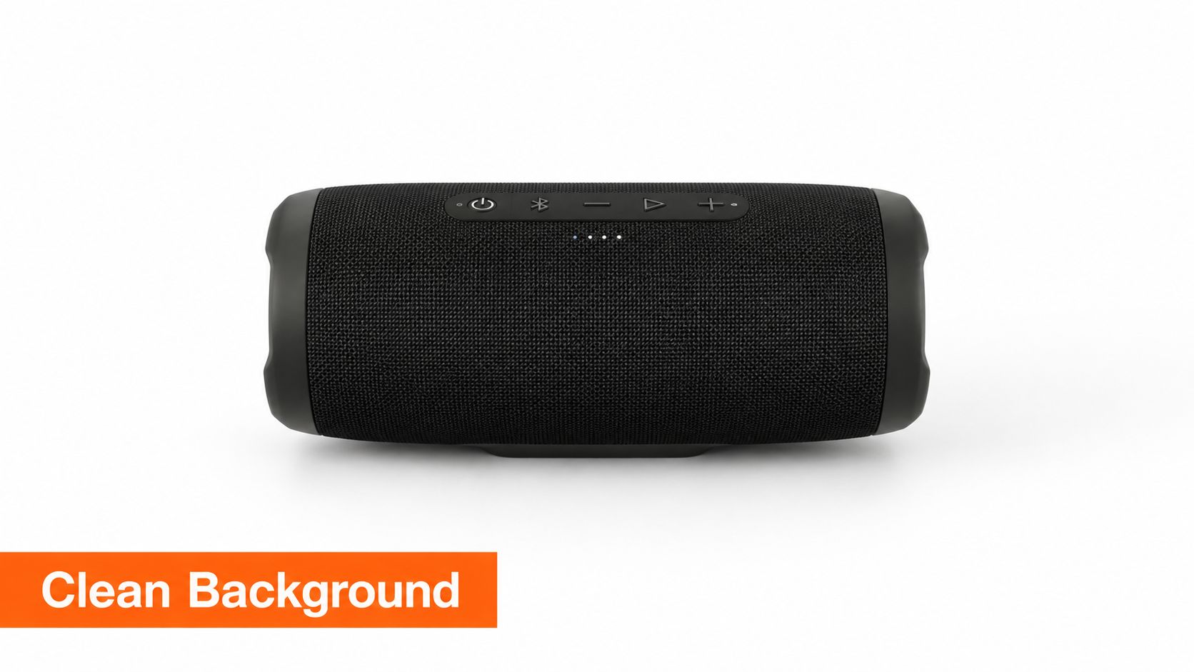
Make the background repeatable
Use a paper sweep, foam board, fabric, or a smooth tabletop. A simple backdrop stand lets you recreate the same setup for future launches. You can also build a small frame from PVC pipe and attach a roll of paper, provided the surface stays smooth and clean.
Keep the product far enough from the background to prevent unwanted shadows. If you need a white background, light the backdrop separately rather than overexposing the product. That keeps labels, edges, and material details visible.
Amazon and Instagram need different visual treatment. A marketplace listing generally benefits from a clean product-first image, while Instagram gives you more room for lifestyle composition. Create the plain image first, then add creative scenes as supporting assets.
- Use white for catalog clarity: Keep your first image easy to scan on product grids and search results.
- Use dark backgrounds with care: Watch reflections on glass, chrome, and glossy packaging.
- Keep the sweep clean: Inspect the background between products and remove lint before it reaches the camera.
- Save the setup: Photograph the backdrop position and light placement so someone else can repeat it.
A plain background isn't boring when it removes doubt. It gives buyers a fast answer to the first question, “What am I looking at?”
3. Nail Your Angles and Perspectives
A single angle can hide the information a buyer needs. Show the front, side, back, and useful details according to the product. A phone case needs a view of its edges and openings. A chair needs views that explain proportions. A watch benefits from a face view, side profile, and close-up of the finish.
Start with a hero image that answers, “What does this look like?” Shoot at product eye level for most items. A straight-on view communicates the face clearly, while a three-quarter view adds depth. Use a flat lay when the product reads best from above, as jewelry, cosmetics, stationery, and tabletop goods often do.
Capture questions in order
Think of your gallery as a conversation. The first image introduces the product. The next view answers a question about construction or size. The close-up answers a question about texture, controls, stitching, or finish. This order helps buyers inspect the product instead of guessing.
Keep the camera height consistent across similar products. If you change height randomly, bottles may appear to tilt and boxes may seem to have different proportions. A tripod makes it easier to maintain framing while you rotate the product.
A turntable can help when you need consistent rotation or a 360-degree sequence. It adds setup time, so reserve it for products where movement explains value, such as furniture, footwear, luggage, or items with important rear and side details. You don't need a rotating sequence for every SKU.
- Hero view: Lead with the angle that explains the product fastest.
- Three-quarter view: Show depth without distorting the shape.
- Side or rear view: Reveal thickness, closures, ports, handles, or construction.
- Detail view: Move closer to the feature that supports quality or price.
- Scale view: Place the item in a hand or beside a familiar object when size could confuse buyers.
4. Control Color Accuracy and White Balance
A well-lit product photo can still mislead if its color shifts. A cool white bottle may appear yellow, while a navy shirt can turn black. Buyers then compare the delivered item with an inaccurate image, creating avoidable questions and weakening trust.
Set white balance before capturing the product. Place a gray card under the actual lighting and photograph it at the start of each setup. A color checker gives finer control when exact shades matter, but it adds cost and editing work. Repeat the reference frame whenever you change from window light to LEDs or alter the light arrangement.
Build a reliable color check
If your phone or camera supports RAW, use it for products where color correction matters. RAW files retain more information for adjusting exposure and color, though they need additional storage and editing time. On phones with limited manual controls, lock exposure and white balance when possible. Otherwise, the camera may shift between frames, making a catalog harder to match.
Use one correction across similar products before fine-tuning individual images. This keeps a batch visually consistent and reduces edits made by instinct. Review the results on your monitor and phone, since a neutral image on one display may look warm on another. A calibrated monitor provides a stronger reference for color-sensitive work, but consistent light and a gray card are sensible starting points before buying specialist equipment.
During editing, keep the physical product beside you. Memory is a poor color reference.
- Reference the light: Capture a gray-card frame whenever the lighting changes.
- Match similar products: Batch-edit comparable images with the same correction.
- Inspect the edges: Check white packaging and reflective surfaces for color casts.
- Compare with the physical product: Confirm the image against the item before exporting.
Skincare packaging, fashion, paint, and cosmetics require particularly careful color handling. A lifestyle image can use a warmer mood, but the clean product image should stay close to the item customers will receive. That separation lets the gallery feel styled without sacrificing an accurate sales reference.
5. Invest in Proper Product Staging and Styling
A styled frame should answer a buyer's practical question before it adds atmosphere. A filled coffee cup shows use. A phone case on a compatible phone suggests fit. A hand beside a small jar gives viewers scale. Props earn their place when they clarify ownership, texture, size, or setting.
Start with the product and build around it. A skincare bottle may need only one restrained botanical element. A candle can sit on a bedside table. A coffee bag can appear beside a prepared cup, provided the cup remains secondary.
Keep one clean packshot before styling the scene. It gives your product page a clear reference and lets you remove props later without losing the functional image.
Set rules you can repeat
Choose surfaces, props, and colors that a small brand can source again. A simple rulebook might specify pale stone, warm wood, or a solid color, along with the amount of empty space, the direction of entering hands, and whether usage scenes use a top-down or table-height view. This consistency supports a recognizable identity, as outlined in this product branding guide.
Test each composition with your phone before setting up full lighting. A quick preview reveals distracting objects, awkward tangents, and props that touch the package edge. It also prevents time spent cleaning a scene that will be discarded.
Use these checks during the shoot:
- Show the benefit: Select a prop that demonstrates how someone uses the item.
- Show scale: Add a hand, cup, book, or familiar desk object when dimensions may confuse.
- Protect the label: Keep props away from essential text and product information.
- Keep the scene repeatable: Choose items you can find again for the next collection.
Styling should support the product, not compete with it. If a prop becomes the first thing you notice, remove it or move it farther from the focal area. A restrained setup is faster to reproduce and easier to keep consistent across future shoots.
6. Shoot Multiple Takes and Create Variations
A single frame rarely serves every sales channel. Your product page may need a clear hero image, while social content may need a vertical crop, a lifestyle scene, or a close detail. Capture those versions during the same setup so you do not rebuild the scene later.
Start with a shot list, then work through it in a deliberate order. Photograph the clean hero first, followed by alternate angles, detail views, a scale reference, and an environmental variation. Keep the product position controlled as you change crop and framing. A wider frame can leave room for channel-specific crops, text overlays, and ad layouts.
Build the list around the job each image must perform:
- Catalog set: Show the product alone against the approved background.
- Inspection set: Cover the side, rear, underside, closure, texture, or controls.
- Context set: Place the product where buyers will use it.
- Social set: Leave space for vertical crops and short-form content.
- Archive set: Name and store the original files for later reuse.
Make small, purposeful changes between takes. Rotate the product, move one prop, switch from a close crop to a wider view, or add a hand demonstrating use. Keep a clean version in every batch. Creative images can support the functional image, but they should not replace it.
Review the files before dismantling the setup. Check that the packaging, size, and use are each explained somewhere in the set. If one is missing, reshoot while the lighting and styling are still ready.
Use this product launch checklist template to connect the shot list with the wider launch work. A planned variation set gives a small brand more usable content without making the catalog feel inconsistent.
7. Master Focus and Sharpness for Impact
Buyers need to inspect the product without squinting at a soft image. Stabilize your phone or camera on a tripod, tap the product's main feature to set focus, and inspect the result at full size before you pack away the setup.
For most product work, start around f/8 to f/11 when your camera supports manual aperture. This range often gives you enough depth of field to keep the product readable while avoiding the extreme softness that can appear at very small apertures. A lower setting can soften the background, but it may leave the front and back of a deep product at different focus points.
Use stability instead of sensor gain
Keep ISO low to reduce noise. Technical guidance recommends working around ISO 100 to 200 and using a tripod so you can select a shutter speed that fits the available light instead of pushing sensor gain. The camera settings guidance from The Media Mastery explains this low-noise approach.
A tripod also keeps every angle aligned. Turn off handheld stabilization if your camera recommends doing so on a locked tripod, and use a timer or remote trigger to avoid nudging the setup.
Jewelry, deep boxes, and complex objects may need focus stacking. Capture several images with different focus points, then blend them in editing. That takes longer, but it works better than forcing one frame to keep every plane sharp.
Sharpness should follow the buyer's question. If the finish sells the item, put the finish in focus. If the shape sells it, keep the full outline clear.
Review the hero image, the detail shot, and any view with small text. A blurry secondary image can still create doubt, even when the first image looks good.
8. Optimize for Your Specific Sales Channel
The same product photo can succeed in one placement and fail in another. Start by checking the frame, crop, screen size, and surrounding copy required by the channel. Leave controlled breathing room around the product, while keeping it large enough to inspect quickly on a phone.
Marketplaces usually need a clean product-first hero image plus supporting views that answer practical questions about size, details, and use. Social posts may need square or vertical crops, with lifestyle context when it helps the product make sense. Your own store can support a fuller gallery, but mobile shoppers still need the item to read immediately.
Build one master set, then export versions
Capture the highest practical quality your setup allows. Keep the original files untouched, then create separate exports for the catalog, social posts, ads, and marketplace listings. Clear folder names prevent a cropped social image from being uploaded as a product detail shot.
The plan notes for marketplace imagery call for 85+ pixels per inch and 1000+ pixels on the longest side for Amazon assets. Check the current marketplace rules before publishing, since requirements can change. The repeatable workflow is simple: preserve a high-resolution master, then export files for each actual placement.
For founders connecting photography with store operations, this guide to starting an ecommerce business offers broader launch context.
Use this export checklist:
- Website image: Keep the product large enough to inspect on mobile.
- Social crop: Capture square and vertical options when the channel requires them.
- Ad creative: Leave clear space for copy without covering the product.
- Marketplace hero: Keep the frame simple and follow current listing rules.
- File naming: Include the product, angle, and channel so the correct version is easy to find.
Preview every export on a phone before publishing. Desktop review can conceal awkward crops, unreadable details, and text placed too close to an edge. Save the approved versions in one shoot folder so the next product follows the same path.
9. Edit Responsibly to Enhance, Not Deceive
Editing should clean the photograph while keeping the product truthful. Correct exposure, balance color, remove dust, and adjust contrast with restraint. Recheck the original during the process, since several small changes can gradually alter the product's appearance.
Remove lint from a shirt, a fingerprint from glass, or a stray spot on a plain background. Keep meaningful wear, texture, and natural variation visible. Do not reshape the item, change its color, hide a flaw buyers should understand, or add details that are not physically present.
Set rules before you edit
Create a basic preset for similar products. It can standardize exposure, contrast, cropping, and color treatment, but inspect every image manually. One bottle may catch a reflection, or one label may sit at a different angle, and a preset cannot judge whether that difference is acceptable.
AI tools can speed up background removal, batch cropping, and routine cleanup. The The FrameOnce report on product photography workflows supports automation for larger batches, while final approval should remain with a person who can compare the image with the physical item.
Use this review pass before approving an export:
- Correct exposure: Lift a dark frame without flattening texture.
- Preserve color: Match the physical product under the shoot lighting.
- Remove distractions: Clean dust and lint, but retain meaningful marks.
- Compare versions: Check the original beside the edited image.
- Review AI output: Inspect edges, labels, textures, and proportions for accidental changes.
For a small-brand workflow, save the original, edited working file, and approved image separately. That record makes revisions easier when a listing needs a new crop or a customer questions how the product is represented.
The final test is simple: the customer should receive what the image promised. Editing then serves quality control rather than disguising the product.
10. Build a Consistent System and Workflow
A repeatable shoot system keeps small-brand production predictable. Photograph the setup before packing it away, then record the surface, backdrop, light positions, camera height, product distance, and angle sequence. That reference helps you rebuild the scene after a break or hand the task to someone else.
Use the same production order each time: prepare the product, build the background, position the light, set white balance, mount the phone or camera, capture the hero image, add supporting views, check sharpness, edit, and export. A fixed sequence reduces missed shots and preventable rework.
Create a short shot guide for each category. For shoes, list left, right, top, sole, and detail views. For skincare, specify the front label, side information, cap, texture, and usage context. Decide these views before shooting, while the product and props are ready.
A practical file system matters as much as the setup. Name files with a pattern such as product-angle-variation-date. Store originals apart from working files, then place approved exports in a channel folder so an old version does not reach a listing.
Use this shoot-day checklist:
- Setup record: Lights, positions, distances, and backdrop materials.
- Shot guide: Approved angles for the product category.
- Editing rule: Crop, color treatment, and cleanup standard.
- File structure: Originals, working files, approved exports, and social versions.
- Quality review: Focus, color, dust, reflections, labels, and crop before upload.
Keep the system simple enough for a busy day. If only one person understands it, document the steps until another person can reproduce the shoot without guessing. That is the difference between a personal habit and a workflow.
10-Point Product Photography Tips Comparison
| Technique | Implementation complexity 🔄 | Resource requirements ⚡ | Expected outcomes 📊 | Ideal use cases 💡 | Key advantages ⭐ |
|---|---|---|---|---|---|
| Master Lighting as Your Foundation | Moderate: low with window light, higher for 3‑point setups | Low–Medium: natural light free; LED panels, reflectors for consistency | High: improved visibility, dimensionality, controlled shadows | All products; especially jewelry, watches, skincare | High: transforms appearance, emphasizes details |
| Use a Plain, Intentional Background | Low–Medium: simple but needs space/setup | Low: seamless paper, backdrop stand or DIY boards | High: consistent catalog, reduced distractions | E‑commerce listings, Amazon, product catalogs | High: clean, versatile, platform-ready |
| Nail Your Angles and Perspectives | Medium: requires planning and extra shots | Medium: tripod, turntable, extra shooting time | High: clearer product understanding, fewer returns | Products needing dimension: furniture, footwear, watches | High: showcases features, communicates scale |
| Control Color Accuracy and White Balance | Low–Medium: simple steps but demands consistency | Low–Medium: gray card, calibrated monitor, RAW capture | High: true-to-life colors, fewer color-related returns | Color‑critical items: apparel, cosmetics, paint | High: builds trust; consistent color across sets |
| Invest in Proper Product Staging and Styling | Medium–High: planning and creative skill required | Medium: props, styling time, possible models | High: emotional connection, premium perception | Lifestyle/DTC brands, social media, premium products | High: storytelling, differentiation, perceived value |
| Shoot Multiple Takes and Create Variations | Medium: more shooting and organization | Medium: extra time, storage, file management | High: versatile content library, enables A/B testing | Omnichannel sellers, seasonal campaigns, marketing | High: reduces repeat shoots, long-term content value |
| Master Focus and Sharpness for Impact | Medium–High: technical skills (focus stacking, DoF) | Medium: tripod, sharp lenses, stacking software | High: clear details, perceived quality, trust | Detail-oriented products: jewelry, electronics, textiles | High: clarity builds confidence; shows craftsmanship |
| Optimize for Your Specific Sales Channel | Medium: learn platform rules and formats | Low–Medium: templates, presets, extra framing | High: improved conversion, correct display across platforms | Amazon sellers, Instagram-first brands, websites | High: tailored presentation boosts performance |
| Edit Responsibly to Enhance, Not Deceive | Medium: editing skill and ethical restraint needed | Low–Medium: editing software, trained editor, time | High: polished yet accurate images; maintained trust | All brands; critical for authenticity-focused companies | High: fixes flaws while preserving product truth |
| Build a Consistent System and Workflow | Medium: upfront documentation and setup | Low–Medium: checklists, presets, training materials | High: repeatable quality, faster shoot-to-publish | Growing teams, high-volume catalogs, recurring shoots | High: scalable, trainable, ensures brand consistency |
Turn Your Next Shoot Into a Repeatable Win
Your next session doesn't need a larger room or a more expensive camera. It needs a short sequence you can repeat without making decisions from scratch. Start by cleaning every product, removing fingerprints, smoothing labels, and checking caps, closures, seams, and packaging. Small defects become obvious once you add bright, controlled light.
Set the background before you place the product. Remove lint, wrinkles, stray objects, and visible edges that compete with the item. Then lock the light. If you use window light, keep the product and surface in the same relationship to the window. If you use LEDs, record their position and brightness so the next batch matches the first.
Set white balance before you capture the final frames. Use a gray card when you need color control, and inspect white packaging for warm or cool casts. Mount the phone or camera on a tripod, keep ISO low, and focus on the product's most important detail.
Capture the hero angle first. That image should explain the product immediately and work as the cleanest product-page entry point. Add side and detail views that answer questions about construction, size, texture, controls, closures, or included parts.
Create a lifestyle variation after you finish the clean set. Add a hand, a familiar object, or a relevant environment when it clarifies scale or use. Keep the scene restrained so the product remains easy to identify.
Your shoot-day checklist
- Clean the product: Remove dust, fingerprints, lint, loose threads, and packaging flaws.
- Fix the background: Smooth the sweep and remove anything that competes with the product.
- Lock the light: Keep direction, intensity, and color stable across the batch.
- Set white balance: Use a neutral reference before the final capture.
- Capture the hero angle: Lead with the clearest product-first view.
- Add side and detail views: Show the construction and features buyers may question.
- Create a lifestyle variation: Use context to communicate scale or ownership.
- Review sharpness: Inspect the hero and detail frames before breaking down the setup.
- Edit conservatively: Correct exposure, color, dust, and crop without changing reality.
- Export channel-ready files: Preserve masters and create versions for product pages, social posts, and ads.
Save this process with your style guide and update it after each session. If a crop fails on mobile, change the framing rule. If a color shifts between products, improve the light reference. If you keep missing a useful detail, add it to the category shot guide.
The numbers support a practical approach. Research summaries report that high-resolution product photos convert about 94% better than low-resolution images, and listings with 7 or more images convert at 2.4 times the rate of single-image listings. ElectroIQ's product photography statistics provides those benchmarks. You don't need to chase a specific gallery size for every product, but you should give buyers enough views to inspect the item with confidence.
Scale also changes the workflow. The same 2025 market report says nearly 55% of mid-sized online retailers outsource part or all of their product photography, while about 30% of SMEs use monthly photography plans. Those figures point to a sensible decision for a growing brand. Keep simple, repeatable shoots in-house when they're fast and controlled. Outsource complex materials, large batches, or work that takes you away from higher-value business tasks.
Product photography becomes easier when you stop treating every image as a one-off. Build the setup once, document it, capture the views buyers need, and improve one part of the process after every launch. A clear, accurate image set can reduce hesitation without changing the product itself.
Chicago Brandstarters gives indie founders a free, vetted community for practical feedback, honest founder conversations, and support as they build from an idea toward seven figures. If you want thoughtful input on your product page, brand visuals, or next launch, visit Chicago Brandstarters and connect with a group built around kindness, hard work, and useful operator advice.
Leave a Reply