Most logo advice gets this backward. It tells you to open a tool, pick a symbol, and make something pretty fast, then figure out later whether the mark works on a box, a favicon, or a black background. That's how founders end up with a nice-looking file that collapses the moment real use starts.
A working logo does a different job. It needs to be recognized, reproducible, and defensible across contexts, from a mobile header to embroidery to a marketplace thumbnail. That matters because 75% of consumers say they can recognize a brand by its logo, and a simple logo design makes a brand more likely to be recommended by 64% of consumers. The same source says consistent branding through logos and other visual elements can increase revenue by up to 23% linearity.io logo statistics.
Why Your Logo Job Is Bigger Than the File
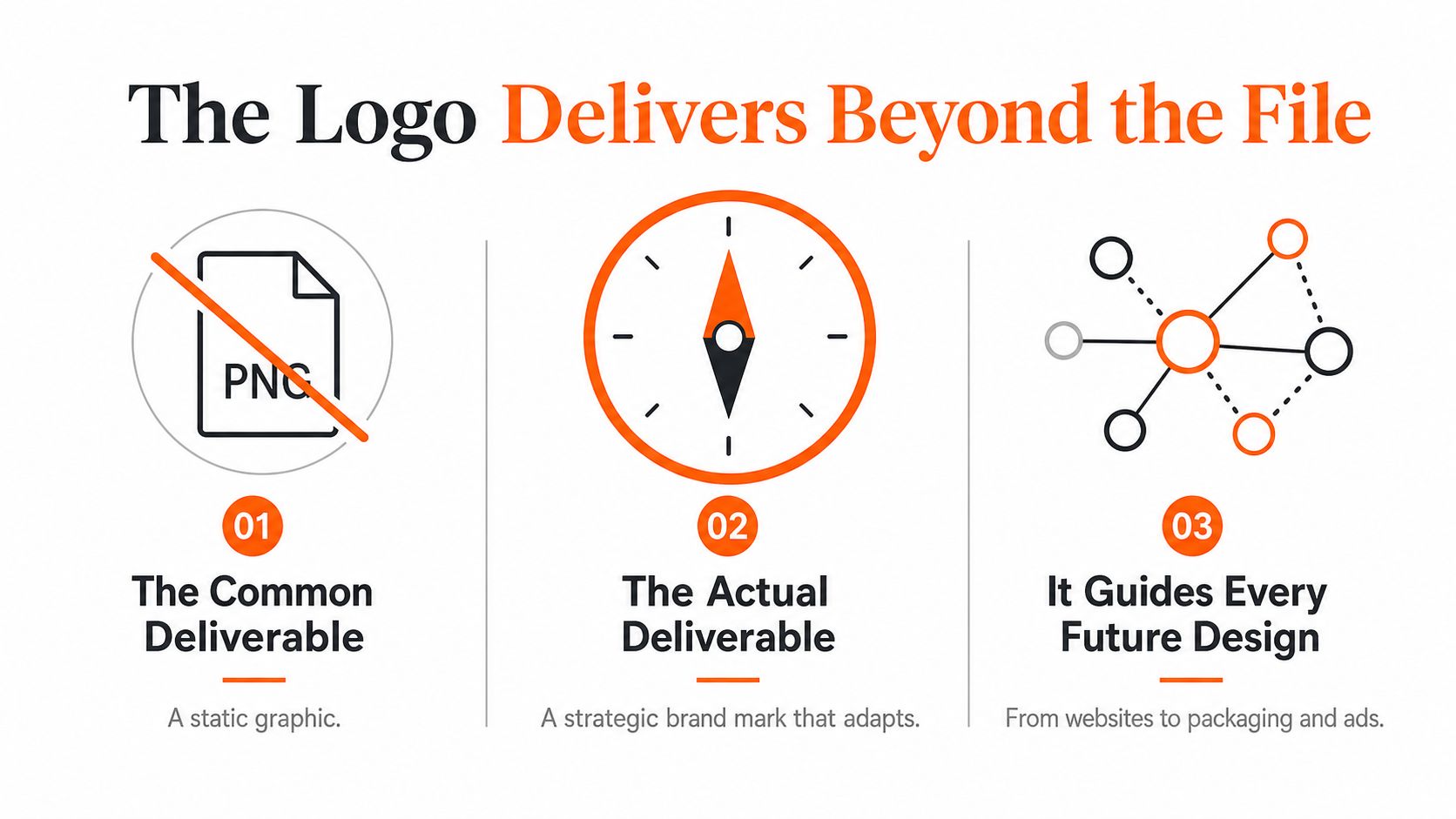
The first mistake is treating the logo like a deliverable instead of a decision system. A file can be exported in minutes. A mark that still works after a shrink to 32 pixels, a one-color print on cardboard, and a future packaging refresh takes more thought than most founders expect.
Start with the actual job
Before you sketch, ask three questions. Who needs to recognize this fast. Where will the logo live in the next six months. What should people feel when they see it next to your product, not just alone on a white canvas. If you can't answer those, you are designing decoration, not identity.
A simple logo often beats a clever one because it clears room for memory. Analysts at linearity.io logo statistics report that major brands tend to redesign their logos on a long cycle, which tells me one thing, a working mark has to outlast the mood that created it.
Practical rule: if your logo only looks good in a mockup, it isn't done. It needs to hold up in the ugliest places your brand will meet.
The other trap is AI tool framing. Many generators push the “make a logo in minutes” promise, which is fine for a first draft and risky for a brand you plan to keep. Adobe Express frames logo creation as a quick enter, pick, customize flow, and Canva does something similar. That speed can be useful, but it also nudges founders to choose output before judgment Adobe Express logo creation.
A logo also sits inside a story, whether you write that story or not. If the naming, positioning, and tone are still loose, the mark will drift with them. I'd start with a short brand story before I touch any symbol, and a practical reference like how to write a brand story can help you keep that foundation clear.
For a founder example, say you run a Midwest specialty coffee roaster. You want a mark that can move from a sack tag to a shipping label to a storefront sign without changing character. That means testing the logo against the actual surfaces it will meet, not only against a clean presentation slide.
Brand Discovery Before You Touch a Design Tool
I've seen founders waste days because they started with taste, not context. The fix is a one-page brief you write for yourself before any sketching. Keep it blunt. Keep it short. Keep it tied to real use.
Write the brief like a buyer will use the brand
Start with the audience. Not “people who like coffee,” but “busy office buyers in the Midwest who want a specialty roast they can trust.” Then write five words for the brand feel. Clean. Warm. Confident. Local. Efficient. Those words don't pick the logo for you, but they cut out a lot of bad directions.
Next, list three competitor logos and what each one repeats. Maybe they all lean on a bean icon, a script wordmark, or a heavy badge shape. That's useful because differentiation starts with noticing the sameness around you. A practical branding guide like design for branding guide can help you translate that market scan into sharper visual choices.
Use the same logic in early product branding. If you're building packaging, a bag label, or a Shopify header, write down the first six months of touchpoints now. A logo that works in a tasting room may fail on a shipping box, and you want to know that before the design gets sentimental.
Gut-check: if your favorite sketch is the one your buyers would ignore, you've answered the wrong question.
For a founder example, say you run a Midwest specialty coffee roaster. Your brief might say: audience, boutique cafe owners and direct-to-consumer buyers. Brand feel, grounded, modern, human, honest, small-batch. Use cases, bags, web header, Instagram avatar, wholesale line sheet, and a delivery truck decal. That's enough to guide a solid first round.
If you want a simple product-branding companion to this process, keep how to brand a product open while you draft. It helps you connect the mark to packaging and launch use without turning the whole project into design theater.
Concepting and Digitizing Your First Draft
Once the brief is tight, I move in four steps. First, research and brainstorm. Second, sketch typography directions. Third, turn ideas into shapes. Fourth, choose color after the form works in black and white. That order keeps you from decorating a weak idea.
Pick the tool that fits your workflow
I use vector-first tools for anything that needs to survive real production. Illustrator and Affinity are solid when you already know how to build clean paths. Figma is useful when you want fast iteration and easy sharing. Canva and Adobe Express are fine when you need guided generation and fast mockups, but they don't replace judgment.
| Tool | Best for | Cost range | Vector output |
|---|---|---|---|
| Illustrator | Precise vector construction | Paid | Yes |
| Affinity Designer | Lean vector work without a subscription mindset | Paid | Yes |
| Figma | Fast team iteration and layout tests | Free to paid | Limited, with export workflow |
| Canva | Guided drafts and quick mockups | Free to paid | Limited, depends on export path |
| Adobe Express | Fast logo starts and simple customization | Free to paid | Limited, depends on output |
A lot of founders get stuck on fonts too early, so if you're comparing type styles, a tool like compare logo font identification tools can help you narrow down what you saw in a reference, instead of guessing and circling the wrong typeface for an afternoon.
Start in black and white. That sounds boring, but it saves time. If the structure works without color, the logo has bones. If it falls apart until you add a gradient, it's carrying too much cosmetic weight.
Build lockups while the idea is still simple
Don't make one logo and hope it stretches everywhere. Make a left-aligned version, a centered version, and versions with and without a tagline. That gives you flexibility across headers, avatars, packaging, and print without redesigning the same mark five times.
Keep the first draft ugly enough to judge and simple enough to remember.
When I digitize a concept, I test the spacing before I polish the curves. A clean wordmark with even spacing usually ages better than a decorative symbol with clever details nobody can see at small sizes. That's where many founder brands break, not in the idea, but in the finish.
The Three Validation Tests Most Founders Skip
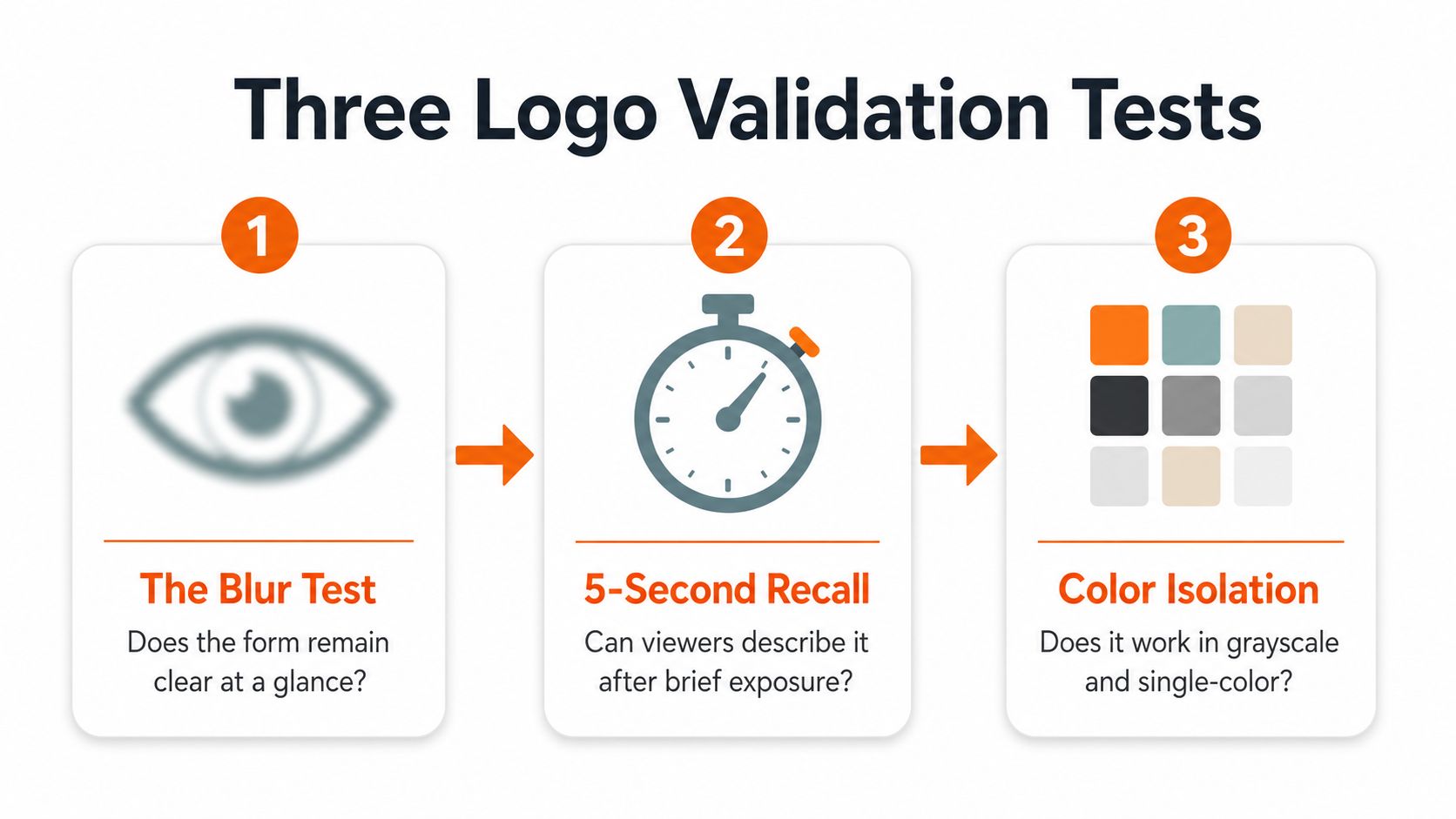
A logo you like is not the same as a logo you can use. Before I call anything final, I run three cheap checks, blur, 5-second recall, and scalability. They take less time than a revision round, and they keep you from falling in love with a mark that only works at presentation size.
The blur test
Blur the logo until the details soften. If you still know what it is, the shape is doing real work. If it turns into a smear of noise, the design is leaning too hard on fine detail, thin lines, or decoration. That is the point to simplify, not to pile on more styling.
The blur test is useful because it shows whether the mark has a clear silhouette. A strong outline survives reduction better than clever texture, and that matters once the logo gets used on small screens, in app headers, or in compressed marketing assets. If the silhouette disappears, the concept is carrying the wrong weight.
The 5-second recall test
Show the logo for five seconds, then hide it. Ask someone what they remember, or have them sketch what they saw. If they cannot describe the shape at all, the mark is probably too generic or too busy to stick.
This is the fastest test I know for memorability. It does not reward polish, it rewards clarity. A founder can spend hours refining curves and spacing, then discover that nobody can remember the symbol after a single glance.
The scalability test
The logo should still read when reduced, cropped, or stripped to monochrome. Expert guidance recommends checking one-color versions and multiple backgrounds before release, because a logo that dies on dark packaging or a tiny social avatar is not ready logo design process guidance. A strong mark should also stay recognizable when blurred or reduced, and the same guidance says unreadable small-size marks usually need simplification or a separate favicon mark YouTube validation guidance.
Fast fix list: remove micro-details, widen gaps, thicken thin strokes, and test again on white, black, and busy backgrounds.
One more practical point. Start in black and white here too, because color can hide weak structure. Adobe's logo guide recommends black-and-white first, then color after the form is strong Adobe logo design guide. That rule saves a lot of false confidence, especially when an otherwise decent idea only looks finished because the palette is doing the heavy lifting.
Exporting Files for Real-World Production
A logo isn't done when it looks right on your screen. It's done when you can hand it to a printer, an embroiderer, a web developer, and a marketplace uploader without getting a confused email back. That means you need the right file set, not just one nice PNG.
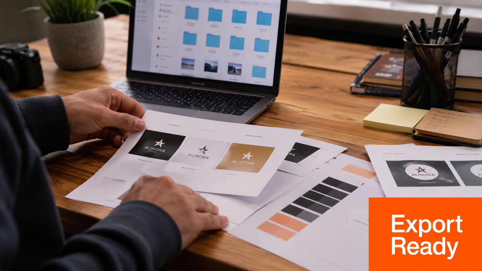
Build the production bundle
Save the master in SVG and PDF. Export transparent PNG files for web and social. Keep a high-res JPG for situations where transparency doesn't matter and a raster file is easier for a vendor. That mix covers most handoffs without forcing a rework later.
Then think about use cases that break weak marks. Embroidery needs clear shapes and enough line weight to survive thread. Packaging needs one-color legibility on kraft paper and on coated stock. Favicons need a simplified version that still reads at tiny size. Storefront vinyl needs spacing that doesn't collapse from a distance.
Make a tiny style guide
You don't need a brand book with fifty pages. You need a one-pager with lockups, clear space, minimum size, approved colors, and the exact files people should use. That sheet stops freelancers from stretching the logo or dropping it onto a loud background because they guessed.
Here's the short checklist I'd keep in your project doc.
- Master files: SVG and PDF for clean vector handoff.
- Web files: transparent PNGs in the sizes you need.
- Print backup: a high-res JPG for vendors who ask for raster files.
- Usage rules: one-color version, spacing rules, minimum size, and background examples.
- Fallback mark: a small icon or simplified version for avatars and favicons.
If you need a quick reference for how different brand assets show up in the wild, a general blog-logo overview like this one from Wix blog logos is useful for seeing where logos commonly live across homepage headers, favicons, and social channels.
Gathering Feedback Without Spiraling
Bad feedback processes turn a logo project into a committee. Good ones keep the signal and cut the noise. I use two rounds, one early, one late. That's enough to catch obvious misses without letting every opinion drag the mark in a different direction.
Ask the right people the right question
Round one goes to 5 to 10 people who match your buyer, not your designer friends. Send them the same short prompt, and ask what they remember, what feels off, and where they would expect to see the brand used. Don't ask, “Do you like it?” That question invites taste wars, and taste wars waste time.
For organizing comments, a tool roundup like tools for streamlining creative feedback can help you collect notes without losing track of who said what. That matters when you're comparing comments from customers, partners, and one very opinionated friend.
Round two is narrower. You only show the strongest option, maybe with one backup. At that point, you're checking for confusion, not running a design contest. If people keep asking for a different color or background, that often means the presentation is off, not the mark itself.
Separate logo changes from presentation changes
A founder I worked with once gathered feedback on a dark-background mockup and panicked when people said the logo felt heavy. The mark wasn't the problem, the presentation was. We moved the same logo onto a white field, cleaned up the type pairing, and the concern vanished.
That's why you should read comments in layers. Does the symbol need simplification. Does the wordmark need spacing work. Or does the person just hate the mockup style. If you don't separate those, you end up changing the logo to fix a bad slide.
Use feedback to find blind spots, not to hand over authorship.
If you want a sharper method for giving and receiving comments, this guide on how to give and receive feedback is a practical companion. It pairs well with the two-round process because it keeps the conversation useful instead of emotional.
Basic Protection and Smart Usage
A logo needs basic protection before launch, but that does not mean every early brand choice has to become a legal project. Do a straightforward trademark search, compare the mark against what is already in use, and keep the original files somewhere you can find them later.
Keep the logo usable and defensible
Start with the name and the visual mark. If something close already exists in your category, pause and rethink. If the similarities are only partial, keep moving, but write down why your version is different. If the result still feels uncertain, talk to a trademark professional before you put more time into it.
Then write a one-page usage sheet. It should name the master file, list the approved colors, define how much clear space the logo needs, and spell out where it should not be placed. Send that sheet to freelancers, partners, and marketplaces so nobody has to guess.
Back up the working files in more than one place. The most common logo failure I see is simple. The founder loses the vector file and only has a small PNG left. That is a painful way to learn the difference between a working file and a display file.
If you are building in Chicago or the Midwest and want a place to talk through branding with other founders, Chicago Brandstarters is a free community where people share real operator advice, product launch notes, and brand-building lessons. It is one option for founders who want practical feedback while they shape the identity, not after the files are already a mess.
If you want help turning a rough mark into a logo package that can live on packaging, web, and print, Chicago Brandstarters can connect you with founders who have been through the same process. Visit Chicago Brandstarters to find a community that talks through real brand decisions, not just pretty mockups.
Leave a Reply