
I get it. You've poured your soul into building something amazing, but getting people to click that 'Join' or 'Buy' button feels like trying to catch smoke. It frustrates me when I see great products fail for this reason. You're not just looking for more traffic; you want the right people to see your value and take action. That's what conversion rate optimization is all about.
Think of your website as a friendly conversation. Right now, it might be mumbling. I'm going to show you how to make it speak clearly, build trust, and guide your ideal customer straight to your solution. This isn't about manipulating visitors. It’s about you helping them understand why your product is the perfect fit for their problem.
We'll skip the generic advice. Instead, I’ll walk you through 10 specific conversion rate optimization techniques that I've seen work firsthand for founders just like you, especially within our tight-knit Chicago and Midwest communities. These are not just theories; they're actionable steps you can start using today to build momentum and find your people.
In this guide, you will get:
- Prioritized tactics for early-stage founders, from quick wins to long-term strategies.
- Actionable mini-steps for implementing each technique.
- Sample hypotheses and A/B test ideas you can steal.
Let's stop guessing and start building a website that works as hard as you do. I'm going to help you turn those 'maybe' visitors into definite customers who are excited to be part of what you're creating.
1. Value Proposition Clarity
Your value proposition is your website's most critical element. It’s the first thing a visitor sees, and it must instantly answer their subconscious question: “What’s in it for me?” If you can't show someone why they should choose you in under five seconds, you’ve already lost them. I see this as the most fundamental of all conversion rate optimization techniques because it sets the stage for everything that follows. A weak value proposition means even a perfect website design won't save you.

Think of it like a movie trailer. It must grab you immediately. My community, Chicago Brandstarters, aims to solve founder loneliness by connecting kind people. We avoid generic promises and get straight to the emotional core of the problem.
How I Sharpen a Value Proposition
- Lead with Emotion: Instead of saying “founder networking,” I advise you to try “Stop building alone. Start building with Chicago's kindest founders.” You're selling relief from isolation, not just another meeting.
- Emphasize What Makes You Different: What makes you unique? For us, it’s “Peer support without self-promotion; confidential dinners, not transactional networking.” This directly contrasts with the bad experiences many founders have.
- Address Pain Points Directly: You should acknowledge the user's struggle. Mention loneliness, the stress of trial-and-error, or the difficulty in finding trustworthy advisors.
- Get Specific: I find that “$6-8 person dinner events” feels more real and approachable than vague “networking events.” Specificity builds your trust and makes the offering tangible.
My Key Insight: A great value proposition isn’t about what your product is; it’s about what your customer becomes. Are they more efficient, less lonely, more profitable, or happier? I want you to focus on that transformation.
My A/B Testing Ideas
To apply this technique, you can test different angles of your value proposition. I suggest creating variants of your headline that focus on different user motivations. For a community like ours, you could test:
- Hypothesis A (Aspiration-focused): “Join the founders building Chicago’s next million-dollar brands.”
- Hypothesis B (Community-focused): “Find your people. Build your business with friends you can trust.”
- Hypothesis C (Problem-solving-focused): “Solve your toughest startup challenges with a confidential peer advisory board.”
You should track sign-ups for each variant to see which motivation resonates most. This simple test can give you powerful insights into your audience’s deepest needs.
2. Social proof and testimonials
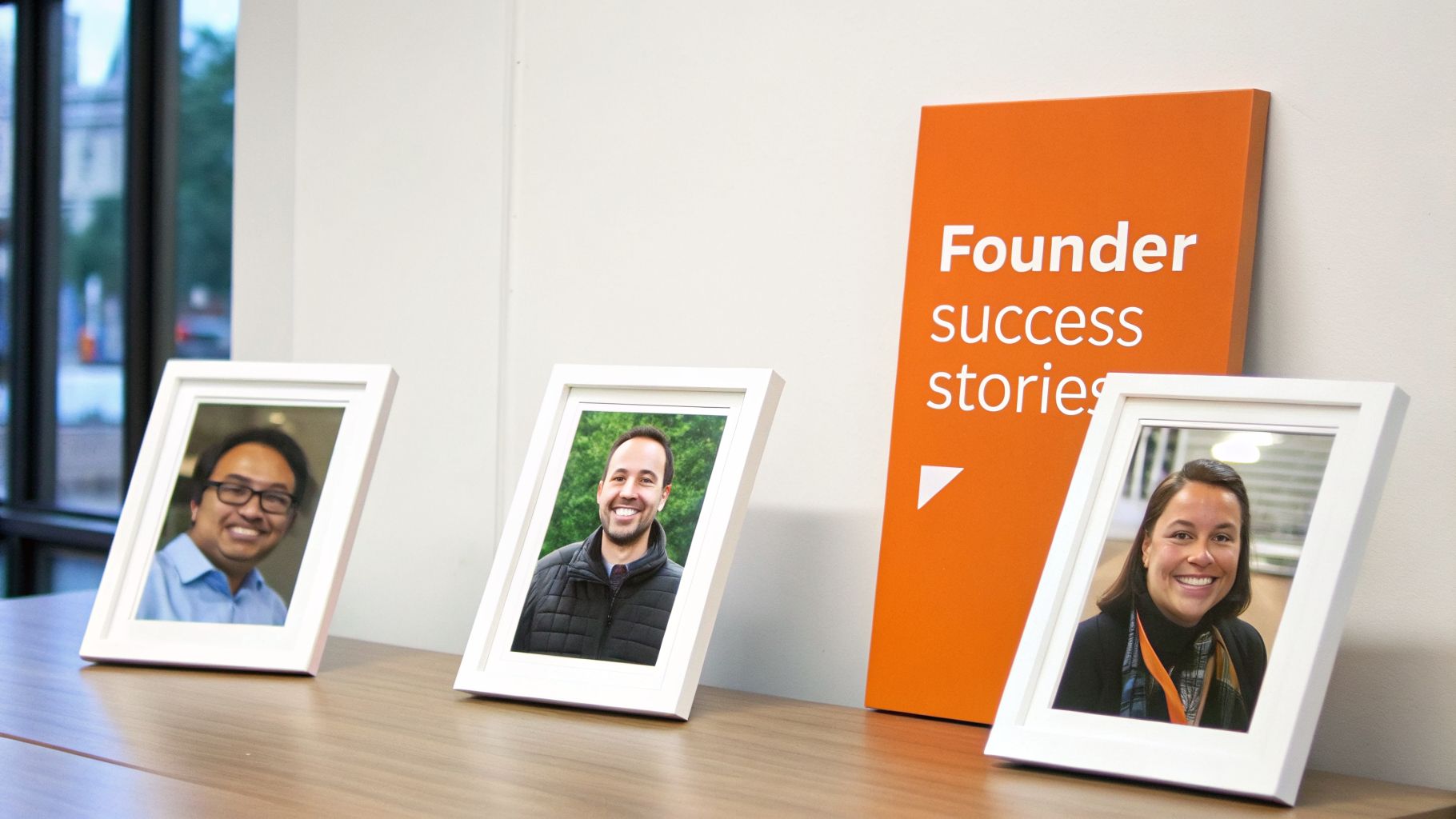
Your claims are just claims until someone else backs them up. This is why I believe social proof is one of the most powerful conversion rate optimization techniques. Seeing that real people, just like them, found success with your product erases doubt and builds trust. For my community, founder testimonials are not just nice to have; they are the proof that our promise of genuine support actually delivers. When you see another founder’s story, you see your own potential future.
Imagine trying to pick a restaurant in a new city. You're more likely to choose the one with a line out the door, not the empty one. People trust people. We do the same by featuring stories that highlight not just revenue wins but the relief of finding a supportive peer group. This shows we deliver on both the practical and emotional promises we make.
How I Showcase Social Proof
- Get Specific and Diverse: I recommend you feature 3-5 testimonials on your signup page from founders in different industries. Showcasing a variety of outcomes helps more visitors see themselves in the success stories.
- Mix Formats: You should combine short, powerful quotes with longer stories. If you can, 30-60 second video testimonials are gold because they add a layer of authenticity text can’t match.
- Respect Privacy, Highlight Wins: You can build trust without breaking it. I get permission and use formats like “Sarah K., B2B SaaS Founder” to show credibility while respecting confidentiality. Focus on the win, whether it’s “landed our first enterprise client” or “found a co-founder.”
- Feature Your Mentors: I remind you not to forget that social proof also comes from experts who endorse you. Featuring respected mentors signals quality and credibility.
My Key Insight: You don't buy what I sell; you buy what other people have already bought and loved. Your best marketing will always be a happy customer’s own words.
My A/B Testing Ideas
To optimize your social proof, I want you to test which type resonates most. Set up variants on your landing page and measure which one drives more applications.
- Hypothesis A (Aspiration-focused): You could feature testimonials that only talk about major business milestones, like fundraising.
- Hypothesis B (Relatability-focused): You could showcase stories that focus on overcoming a common struggle, such as burnout or loneliness.
- Hypothesis C (Video-focused): I would replace your top three text testimonials with short, authentic video clips from the same founders.
3. Landing Page Optimization
Driving traffic to your homepage is a common mistake. It's like sending party invitations to a generic city address instead of a specific house. I see dedicated landing pages as hyper-focused pages designed for a single purpose. They eliminate distractions and speak directly to a visitor's needs, which is a powerful conversion rate optimization technique. By creating a unique page for each persona, you match your message to their motivation, dramatically increasing the chance they'll take action.

Think of it like a specialist doctor. You go to a cardiologist for your heart, not a general practitioner. For Chicago Brandstarters, we don't just have one funnel. I build specific entry points for side-hustlers, e-commerce founders, and idea-stage builders, ensuring each person feels like we're talking directly to them. This specificity is how you make a visitor feel understood.
How I Optimize Landing Pages
- Segment Your Audience: I want you to create separate pages for each founder type. An idea-stage founder needs validation, while a growing e-commerce founder may want practical wins like factory tours. Tailor the entire page for that one person.
- Lead with Your Differentiator: Our landing pages for mentors emphasize our “kindness-first founder selection,” assuring them their time will be spent with vetted, high-character builders. I make this crystal clear.
- Show, Don't Just Tell: You should use testimonials and specific examples. Instead of “great networking,” use a quote that mentions “confidential war story sharing” or a photo from one of our “6-8 person private dinners.” For Shopify store owners, this is especially critical; if you're looking for more guidance, check out my advice on conversion rate optimization for Shopify.
- Connect with Local Culture: We use Chicago imagery and messaging that resonates with Midwest values of hard work and genuine connection. This makes our community feel like a local home base, not a generic national group. I believe this makes a huge difference.
My Key Insight: A landing page isn't a smaller version of your website. I see it as a focused conversation with a single customer about a single problem, with a single solution.
My A/B Testing Ideas
To apply this technique, you can test different offers or angles on your landing pages. For a page targeting early e-commerce founders, I suggest you could test:
- Hypothesis A (Problem-solving-focused): “Solve Your Toughest Supply Chain Hurdles. Get access to peer advice and local factory tours.”
- Hypothesis B (Community-focused): “You’re Not Alone on Shopify. Join Chicago e-commerce founders who share their wins and losses.”
- Hypothesis C (Network-elevation-focused): “Meet the Operators Behind Chicago’s Breakout Brands. Elevate your e-commerce game.”
You should track form submissions for each variant to learn what offer most effectively converts this specific founder persona. This lets you refine your messaging based on direct market feedback.
4. Email Sequence Optimization
A visitor signing up for your email list is a huge win, but it’s just the beginning. I see too many founders let that lead go cold. Automated email sequences are one of the most powerful conversion rate optimization techniques because they let you build a relationship on autopilot. Instead of one generic welcome message, a strategic sequence nurtures prospects over days or weeks, delivering value long before you ask for a commitment.
This is your direct line to a prospect’s inbox, a personal space where you can tell your story. Think of it like a friendly guide who meets a new visitor at the door and slowly shows them around. You answer questions and make them feel comfortable before inviting them to join the party. I admire how great sequences, like those from Zapier or Slack, feel less like marketing and more like helpful onboarding.
How I Build a Nurturing Email Sequence
- Email 1 (Immediate): Welcome & Reassure. You should confirm their signup and immediately restate the value proposition. Remind them what problem you solve. For my community, this email confirms they’ve taken a step to "Stop building alone."
- Email 2 (Day 2): Share Your Story. I introduce the founder (that's me, Kevin!) and the "why" behind the community. People connect with people, not just brands. This helps you build an emotional connection.
- Email 3 (Day 4): Provide Social Proof. I recommend featuring 2-3 powerful testimonials. Let other founders describe the real-world wins they've experienced.
- Email 4 (Day 7): Address Key Questions. You need to explain the format and logistics. For us, this means clarifying how our small, confidential dinners work, preemptively answering questions about privacy.
- Email 5 (Day 10): Make the First Ask. I directly invite them to a specific upcoming event with the date and location. This makes the invitation tangible.
My Key Insight: Your email sequence shouldn't be a constant sales pitch. I think of it as a conversation. You should aim for an 80/20 split: 80% of your content gives value (stories, insights), and only 20% asks for something.
My A/B Testing Ideas
To optimize your email sequence, you should focus on the click-through rate (CTR) on your main call-to-action. I want you to test different email subject lines or the CTA button copy itself.
- Hypothesis A (Benefit-Oriented Subject Line): "Your solution to founder loneliness is inside"
- Hypothesis B (Curiosity-Oriented Subject Line): "What we do at our confidential dinners…"
- Hypothesis C (Direct-Ask Subject Line): "Ready to meet your peers? Invitation to our next founder dinner."
You should track the open rates and the CTR for the main link inside the email. This data will tell you what messaging most effectively moves a subscriber from being a passive reader to an active participant.
5. Form Field Reduction and Progressive Profiling
Think of your sign-up form as the first handshake. If you immediately ask for their life story, they'll pull back. I see asking for too much information upfront as a primary source of friction. This is why form field reduction and progressive profiling are essential conversion rate optimization techniques; they respect your user's time and build trust by asking only for what's necessary right now.
This approach is like a good conversation. You don't ask intensely personal questions right away. For Chicago Brandstarters, our initial sign-up form only asks for an email, first name, and founder stage. That’s it. It’s low-commitment. We gather deeper information later, once we've already delivered value and earned the right to ask for more.
How I Implement Progressive Profiling
- Minimize the Initial Ask: I want you to start with the absolute minimum information needed. For us, that's just enough to send a personalized welcome email.
- Use Subsequent Touchpoints: In the welcome email, we might ask for their business type. Before their first dinner, we ask, "What's your biggest business challenge right now?" This question is timely and relevant.
- Explain the "Why": You should be transparent. When asking for information, briefly explain how you'll use it. For example, "Knowing your challenge helps me seat you with founders who can help."
- Track Form Completion Rates: I recommend you monitor analytics to see where users drop off. If 80% of people abandon your form after the "phone number" field, you know that’s a point of friction.
My Key Insight: You should treat user data like a currency. You have to earn it by providing value first. Each piece of information you request should have a clear purpose that benefits the user, not just you.
My A/B Testing Ideas
I suggest you test which fields cause the most friction. Create versions of your sign-up form with slight variations.
- Hypothesis A (Minimalist): A single "Email Address" field to maximize initial sign-ups.
- Hypothesis B (Personalized): "Email Address" and "First Name" to allow for personalized follow-up.
- Hypothesis C (Segmented): "Email," "First Name," and a single dropdown for "Founder Stage" to immediately segment the audience.
You should measure the submission rate for each variant. You might find that adding one key field slightly lowers conversions but dramatically improves your lead quality, making it a worthwhile trade-off.
6. Trust Building and Credibility Signals
For a community built on trust, demonstrating credibility isn't just a marketing tactic; it's the entire product. I know visitors, especially founders, are constantly scanning for proof that you’re legitimate. Without clear trust signals, they will assume the worst and leave. This is one of the most essential conversion rate optimization techniques because it directly addresses your user's primary fear: "Is this a waste of my time?"
Think about a password manager. You wouldn't use one without seeing proof of its security, like encryption standards or third-party audits. You instantly trust it because of the signals it provides. Similarly, my community needs to show, not just tell, that we are a safe space for founders.
How I Build Credibility Signals
- Show the Person Behind the Curtain: Instead of a faceless brand, I feature my background and a direct link to my LinkedIn profile. This makes the community accountable to a real person.
- Explain Your Vetting Process: We are clear about how we protect the group's integrity. I find that stating we use "LinkedIn verification to block self-promoters" tells people we value their time.
- Showcase Member Quality: You can highlight the diversity of your members by mentioning their industries or roles without breaking confidentiality, for example, "Our members include founders in SaaS, CPG, and hardware."
- Define What You're Not: Sometimes, I find saying what you won't do is more powerful. We state clearly: "This is not a pitch-fest." This directly counters the negative experiences most founders have and builds your trust.
My Key Insight: You don't build trust with grand claims but with small, verifiable proofs. Every element on your page should answer the visitor's question, "Can I trust these people with my time and vulnerability?"
My A/B Testing Ideas
To apply this technique, I want you to test which credibility signals resonate most. Create different versions of your "Join" page that emphasize different trust elements.
- Hypothesis A (Founder-focused): A headline and bio section that heavily features my own founder journey.
- Hypothesis B (Process-focused): A version that prominently displays the strict member vetting process right below the main call-to-action.
- Hypothesis C (Social Proof-focused): If you have them, feature testimonials with real names and photos, or logos of publications that have mentioned you.
By tracking application rates from each variant, you can learn whether your audience is more persuaded by my story, the community's rules, or external validation.
7. A/B Testing (Split Testing)
A/B testing is your engine for improvement. It’s a controlled experiment where you show two versions of a webpage to different groups of your audience at the same time. By tracking which version drives more of your desired action, you can make data-informed decisions instead of relying on guesswork. I believe this is one of the most powerful conversion rate optimization techniques because it removes ego from the equation, letting your users tell you what works.
Think of it like an eye exam. The optometrist flips between two lenses and asks, "Which is better, one or two?" You give direct feedback, and the result is a perfect prescription. Similarly, Netflix constantly tests different thumbnail art for its shows to see which one gets you to click. It's about making small, calculated bets to achieve big wins over time.
How I Run Effective A/B Tests
- Start with High-Impact Elements: I urge you not to waste time testing the color of a footer link. Focus on what matters most: your main headline, call-to-action (CTA) button, and hero image.
- Formulate a Clear Hypothesis: Every test should start with an "If I change X, then Y will happen because Z" statement. For example: "If I change the CTA button from 'Join Now' to 'Meet Your Peers,' then sign-ups will increase because it focuses on the community benefit."
- Run Tests Long Enough: You should let your test run for at least one to two weeks to collect enough data. Ending a test too early can give you false conclusions.
- Test One Variable at a Time: If you change the headline, the image, and the CTA all at once, you won't know which change caused the result. I want you to isolate your variables to get clean, actionable data.
My Key Insight: A/B testing isn't just about finding a "winner." I believe a failed test is still a win because it teaches you what doesn't work and gives you valuable insight into your audience's psychology.
My A/B Testing Ideas
For a founder community, you can apply this conversion rate optimization technique by testing different messaging. I suggest you try creating variations of your landing page copy.
- Hypothesis A (Benefit-driven CTA): Test a button that says “Start Building with Friends” against one that says “Apply for Membership.”
- Hypothesis B (Image-driven Emotion): Test an image of a lively group dinner against a photo of two founders having a focused 1-on-1 conversation.
- Hypothesis C (Form Field Friction): Test a simple one-field form asking only for an email against a multi-field form that also asks for their name and startup stage.
You should measure application start rates and completion rates for each variant. The results will tell you whether your audience prioritizes ease of entry or a more exclusive application process.
8. Activation and Onboarding Optimization (including Urgency & Scarcity tactics)
Getting you to sign up is just the start of the race; the real finish line is activation. Activation is the moment you experience the core value of my product for the first time. For Chicago Brandstarters, it's not just signing up for the email list; it's attending your first dinner and making your first meaningful connection. I see optimizing this journey as one of the most powerful conversion rate optimization techniques because it directly impacts your long-term retention.
Think of it like your first day at a new job. A good company doesn't just give you a laptop and point you to a desk. They introduce you to your team and give you a small, achievable first task. My goal is to create that same feeling of immediate value and belonging for new founders joining our community.
How I Optimize Your Activation Flow
- Define "Activated" Clearly: First, you must define what success looks like. For me, an "activated" founder has attended their first dinner and posted in our private group chat within seven days. This shows they’ve engaged.
- Reduce Pre-Event Anxiety: I find a major friction point is the fear of walking into a room of strangers. I send a pre-event email with a brief bio of each attendee. This turns strangers into familiar faces before the event even starts.
- Structure for Immediate Connection: At the dinner, I start with a confidentiality pledge and a structured icebreaker. This sets a tone of trust and encourages genuine conversation.
- Use Authentic Scarcity and Urgency: I frame scarcity as a benefit to you. I say, "Dinners are limited to 6-8 founders to ensure everyone gets heard. The next dinner has [2] spots left." This isn't a cheap trick; it's a genuine reflection of how we preserve the experience.
My Key Insight: Activation isn't a feature; it's an experience I orchestrate for you. I must guide you by the hand from the moment you sign up until you feel the emotional payoff my product promises. A great onboarding flow makes you feel seen, understood, and successful right away.
My A/B Testing Ideas
To improve your activation rate, you can test different onboarding tactics. These tests are crucial for turning initial interest into deep, lasting engagement, a core part of effective customer retention strategies.
- Hypothesis A (Buddy System): Assigning a current member as a "peer buddy" to welcome new founders will increase their first-post rate.
- Hypothesis B (Personalized Host Message): Sending a direct, personalized message from me after an event will lead to higher re-attendance rates than a generic email.
- Hypothesis C (Urgency Framing): An email that says "Our next dinner is 70% full, book now" will drive more bookings than one that says "Book your spot for our next dinner."
You should track the percentage of new users who complete your activation metric for each variant to see which approach best guides them to their "aha!" moment.
9. Audience Segmentation and Personalization
Treating all your visitors the same is a recipe for low conversions. A founder with a side-hustle has different needs than one managing a team of ten. I define audience segmentation as dividing your traffic into groups based on shared characteristics. Personalization is then tailoring the experience for each group. This is one of the most effective conversion rate optimization techniques because relevance drives action.
Think of it like a personalized playlist. Spotify doesn't give everyone the same "Top Hits" list; it curates music based on your listening history. For Chicago Brandstarters, we don’t just have one “founder” persona. We have side-hustlers, pre-prototype builders, and early-revenue brands. I speak to them differently to show we understand their journey.
How I Segment and Personalize Your Messaging
- Identify Your Core Segments: I ask, who are you serving? For us, it’s distinct groups like side-hustlers (need peer support) and early ecommerce brands (need scaling advice).
- Create Tailored Landing Pages: You should build separate pages with headlines and testimonials that address each segment’s primary pain point. A side-hustler’s page might say, “Build your dream business around your 9-to-5,” while an ecommerce page could offer specific ecommerce growth strategies.
- Customize Your Calls-to-Action (CTAs): Instead of a generic “Join Us,” I suggest you try a specific CTA. For pre-prototype founders, it could be “Validate Your Idea Faster.”
- Segment Your Email Marketing: Don’t send the same newsletter to everyone. I want you to tag subscribers based on their persona and send them content that solves their immediate problems.
My Key Insight: Personalization isn't just about using a first name in an email. I believe it’s about demonstrating empathy by showing you understand a visitor's context and challenges.
My A/B Testing Ideas
You can test which segments respond best to your core offering. I recommend running targeted ad campaigns to different founder personas, directing them to their personalized landing pages.
- Hypothesis A (Side-Hustler Segment): A landing page emphasizing peer support and flexible scheduling will convert more side-hustlers.
- Hypothesis B (Early-Revenue Segment): A landing page focused on solving "stuck" problems and scaling will attract more established founders.
- Hypothesis C (Pre-Prototype Segment): A page offering access to factory tours will have the highest conversion rate for idea-stage founders.
You should track sign-ups from each segment. The results will tell you not just which message works, but which audience is the best fit for your product right now.
10. Friction Audit and UX Optimization
Friction is any obstacle that makes it harder for you to complete your goal on my site. Think of it as psychological resistance. Every confusing button or slow-loading page adds a little bit of weight to your journey. Enough weight, and you'll simply give up and leave. I see a friction audit as one of the most effective conversion rate optimization techniques because it’s about making the desired path the easiest path. You're not trying to trick users; you're clearing the way for them.
Think of it like an airport security line. The best airports get you through with minimal hassle, while the worst ones make you unpack everything and wait forever. For Chicago Brandstarters, this means I must smooth the path from discovering the community to signing up for a first dinner. If a potential member is confused, that’s friction I must eliminate.
How I Conduct a Friction Audit
- Get an Outsider's Perspective: I suggest you ask 5-10 people who know nothing about your brand to complete a key task (e.g., "Find and sign up for the next dinner"). Watch where they hesitate or get confused. This is gold.
- Ensure One Clear Next Step: On every page, you should have a single, obvious primary action. Avoid giving users multiple competing calls to action. For us, that means a clear button like "See Next Dinner Date."
- Optimize for Mobile: Many founders browse on their phones. I want you to test your entire user flow on a mobile device to find frustrating pinch-to-zoom moments or tiny buttons.
- Reduce Information Overload: You should prioritize the essential information that drives a decision. Instead of a long list of features, I want you to focus on the emotional outcome and specific details that build trust.
My Key Insight: Friction isn't just about bad design; it's about cognitive load. The more you have to think, the less likely you are to convert. My job is to make your decision feel effortless and obvious.
My A/B Testing Ideas
Once you've identified points of friction, you can test solutions. I find friction often appears in the application form itself.
- Hypothesis A (Reduced Steps): “Reducing the signup form from 5 steps to 3 will increase form completions by decreasing user effort.”
- Hypothesis B (Clearer Navigation): “Changing the main CTA from ‘Learn More’ to ‘Apply to Join’ will increase clicks by clarifying the next step.”
- Hypothesis C (Credibility Boost): “Adding a short bio and LinkedIn link for me (Kevin Tao) near the application button will increase submissions by building trust.”
You should track the conversion rate for each step in your funnel. A small reduction in friction at one step can have a major positive impact on your final conversion numbers.
Top 10 CRO Techniques Comparison
| Item | Implementation Complexity 🔄 | Resource Requirements ⚡ | Expected Outcomes 📊 | Ideal Use Cases 💡 | Key Advantages ⭐ |
|---|---|---|---|---|---|
| Value Proposition Clarity | Medium — copy + audience research 🔄 | Low–Medium — writer + tests ⚡ | High — faster qualification, higher CTRs 📊 | Homepage hero, ad headlines, landing pages 💡 | ⭐⭐⭐ Immediate clarity; reduces churn |
| Social Proof and Testimonials | Medium — gather & curate testimonials 🔄 | Medium — interviews, possible video production ⚡ | High — trust lift and higher conversions 📊 | Signup pages, landing pages, emails 💡 | ⭐⭐⭐ Peer validation; emotional relatability |
| Landing Page Optimization | Medium — focused design & messaging 🔄 | Medium — design, copy, dev, tracking ⚡ | High — improved conversion rate, better Quality Score 📊 | Campaign-specific landing pages, ads 💡 | ⭐⭐⭐ Increases relevance; measurable wins |
| Email Sequence Optimization | Medium — mapping flows and triggers 🔄 | Low–Medium — automation tool + content ⚡ | High ROI — better nurturing and attendance 📊 | Post-signup nurture, re-engagement, onboarding 💡 | ⭐⭐⭐ Automatable; strong retention lift |
| Form Field Reduction & Progressive Profiling | High — conditional logic & tracking 🔄 | Medium–High — backend, CRM integration ⚡ | High — lower abandonment, improved data quality 📊 | Initial signup, progressive onboarding flows 💡 | ⭐⭐ Reduces friction; enables personalization |
| Trust Building & Credibility Signals | Medium — assemble verifiable signals 🔄 | Low–Medium — content, vetting processes ⚡ | High — reduces perceived risk; attracts quality 📊 | Membership pages, vetting, FAQ, host bios 💡 | ⭐⭐⭐ Encourages vulnerability; justifies selectivity |
| A/B Testing (Split Testing) | Medium — experiment design & analysis 🔄 | Medium — tools + traffic/time ⚡ | Medium–High — incremental, evidence-based gains 📊 | Headlines, CTAs, forms, images 💡 | ⭐⭐ Data-driven improvements; reduces guesswork |
| Activation & Onboarding Optimization | High — operational and product changes 🔄 | High — staff, events, systems ⚡ | Very high — better retention and LTV 📊 | First-event flows, onboarding funnels, scarcity tactics 💡 | ⭐⭐⭐ Drives activation; builds lasting habits |
| Audience Segmentation & Personalization | High — segmentation, dynamic content 🔄 | High — tracking, content variants, targeting ⚡ | High — higher relevance and self-selection 📊 | Segment-specific landing pages, emails, ads 💡 | ⭐⭐⭐ Improves fit; increases engagement & retention |
| Friction Audit & UX Optimization | Medium — user testing + fixes 🔄 | Low–Medium — research and design fixes ⚡ | Medium — lower drop-offs, better UX metrics 📊 | Signup, checkout, mobile experience, navigation 💡 | ⭐⭐ Removes hidden barriers; cost-effective wins |
Stop Guessing, Start Growing
We just covered a huge amount of ground. If you're feeling a bit overwhelmed, take a deep breath. I know that's a normal reaction. The key isn't to implement all ten of these conversion rate optimization techniques by next Tuesday. The real goal is for you to fundamentally change how you approach growth.
You’re no longer just throwing spaghetti at the wall. Instead, you're becoming a methodical builder, a scientist in your own business lab. I want you to think of your website not as a static brochure but as a living system. Every interaction you have is a clue telling me where you get excited and where you get stuck. My job is to listen to those clues and respond with intention.
From Random Acts to a System of Growth
Let’s boil this down to its core. I believe the true power of what we've discussed isn't in any single tactic. The magic happens when you build a repeatable process:
- Observe & Question: Start by watching real users. I use friction audits to ask, "Why aren't people taking the action I want them to take?"
- Hypothesize: You should formulate an educated guess. For example, "I believe adding customer testimonials below the 'Add to Cart' button will increase purchases."
- Test: I want you to run a controlled experiment (like an A/B test) to see if your hypothesis is correct. Isolate the change so you know what caused the result.
- Analyze & Learn: Did your change work? Why or why not? I find the "why" is often more important than the "what." A failed test that teaches you something about your customer's mindset is a massive win.
- Repeat: Take what you learned and apply it to the next question. This is your flywheel of optimization.
This process is what separates the brands that fizzle out from the ones that I see achieve lasting success. It’s the difference between hoping for growth and engineering it. You're replacing guesswork with data-backed confidence. Each test, pass or fail, makes you smarter about your audience.
Your Actionable Next Step
Feeling the pressure to do it all is a trap. I want you to avoid it. Your mission for this week is simple: pick one thing. Just one.
Look back at the ten techniques we covered. Which one feels most achievable for you right now?
- Is your value proposition a little fuzzy? Spend a few hours clarifying it.
- Do you have a great quote from a happy customer in your inbox? Add it to your landing page.
- Is your contact form asking for a prospect's life story? Cut it down to just the essentials.
Pick your single target, form a hypothesis, and make the change. You should measure the result. That's it. You've just started. I see this journey as a marathon of a thousand small steps, not a single giant leap. Each step is a small victory that moves you from a founder who hopes for conversions to an operator who creates them. You're building a predictable engine for growth, and that is one of the most valuable assets you can own.
This is the exact work I do every day within the Chicago Brandstarters community. We help kind, ambitious founders like you move from guesswork to a proven process, sharing real test results so you can learn from our wins and our failures. If you're tired of building alone and want to surround yourself with people who genuinely want to see you succeed, check out Chicago Brandstarters.