

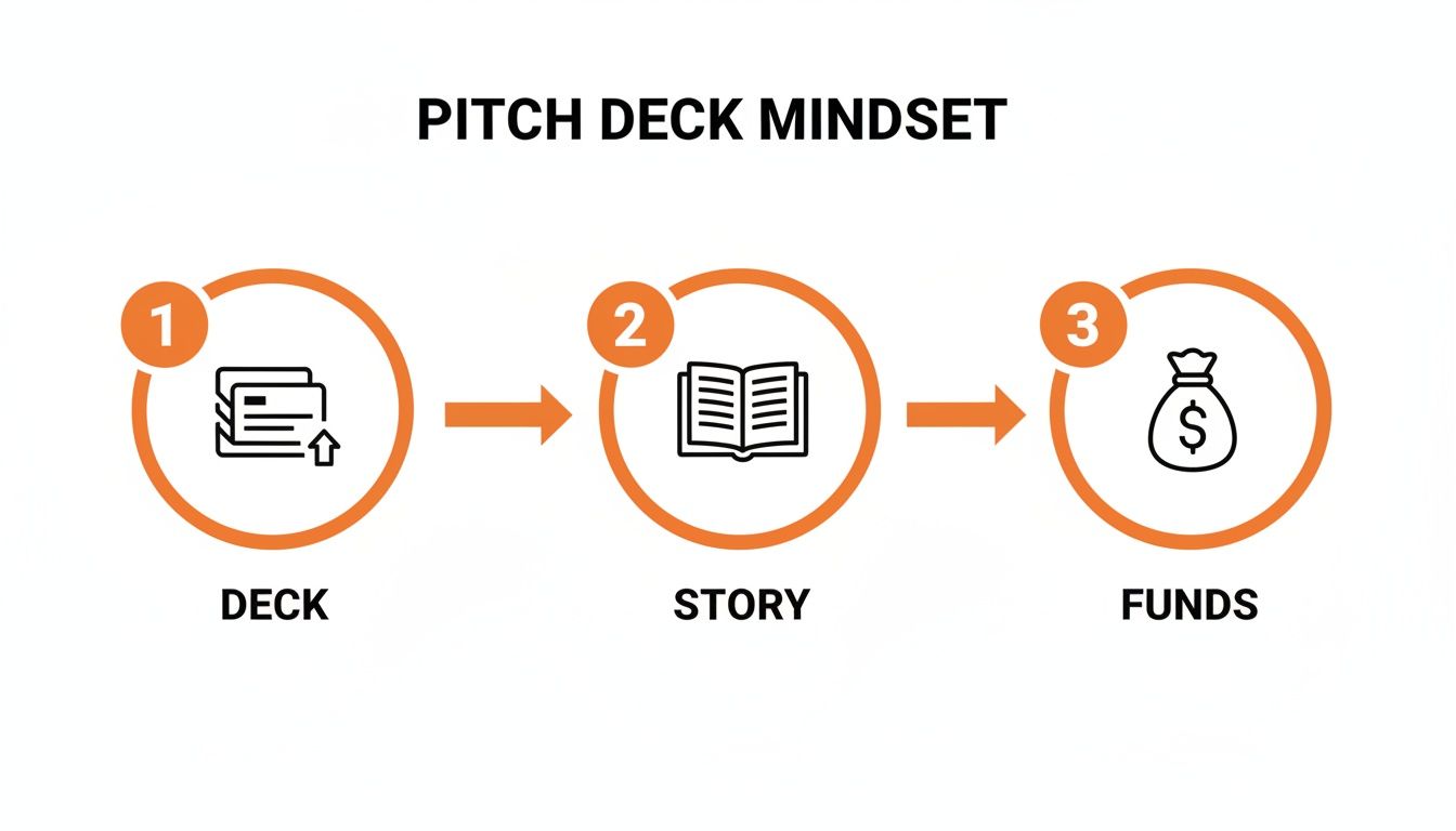
Let’s get one thing straight before we dive into the slides: your pitch deck is not a list of facts. It’s a story. And if you want to raise money, you have to tell a damn good one.
A great deck boils your entire vision down into a crisp, compelling narrative that an investor can actually understand. I'm talking 10-15 slides, max, that cover the problem, your brilliant solution, and why you and your team are the only people on the planet who can pull this off.
Your Pitch Deck Is Your Story, Not Just a Bunch of Slides
I’ve seen hundreds of pitch decks. Most of them? Totally forgettable. Before we get into the nitty-gritty of what goes on each slide, we need to fix a massive mindset mistake I see early-stage founders make constantly.
A pitch deck isn't just a PowerPoint file. You're telling the story of your company's future.
Investors don't really back ideas; they back people and the stories they tell. This is doubly true here in the Midwest. For the founders I work with through Chicago Brandstarters, that whole "fake it 'til you make it" vibe can instantly crater your credibility with a sharp Chicago investor. They value authenticity.
Think of it like building a house. You don't start by worrying about the paint color. You start with a solid blueprint. This is that blueprint for your fundraising brain.
Stop Thinking in Slides, Start Thinking in Story
So many founders grab a template and just start filling in the boxes: "Problem," "Solution," "Market Size." That’s your one-way ticket to a generic deck that looks exactly like the other 50 an investor glanced at that day.
Instead, I want you to put on your movie director hat. What's the story arc here? You have a villain (the painful problem people face) and a hero (your solution, riding in to save the day). Your job is to build tension and make your company’s success feel completely inevitable.
Your goal isn't just to lay out facts. You want to make an investor feel that your success is the obvious next chapter. I want you to make them feel like not being a part of it would be a huge miss.
Framing it as a story forces you to answer the "Why you?" and "Why now?" questions before they’re even asked. You bake it right in.
The Brutal Reality of Your Fundraising Odds
Look, the competition is insane. That’s exactly why your story has to be unforgettable. Investors might glance at about 10% of the decks they get, but the numbers get way worse from there.
According to one analysis, less than 1% of companies actually get funded. For startups pitching angel investors in the US, that number plummets to just 0.91%. Angels fund, on average, only one out of every 400 pitches they see. You can read more about these sobering pitch deck statistics and see why a strong narrative is so critical.
In a sea of "no," your deck is your lifeline.
Your story is what separates the decks that get a five-second scan from the ones that land a meeting. It’s about forging a real connection based on an exciting, believable vision for the future—one that's grounded in the authentic, get-it-done spirit that defines the Chicago and Midwest tech scene.
The 10 Slides That Form Your Core Story
Alright, you’ve got the right mindset. Now it’s time to build. I’m giving you the exact slide-by-slide playbook that has helped founders I mentor land their first checks.
Don't just download a generic template and fill in the blanks—that’s a rookie mistake. I'm going to walk you through the 10 essential slides that form the backbone of a story that gets funded. For every slide, I’ll give you specific advice for where you are right now: an idea-stage founder in Chicago or the Midwest.
Your pitch deck's job is to take an investor on a journey. You turn a bunch of slides into a powerful story, and that story is what unlocks the capital you need.
Think of it this way: your deck builds the narrative, and the narrative makes an investment feel like the only logical next step.
Your Narrative Foundation
The best decks I’ve seen all tell a story in a logical order. You can’t just throw random facts at an investor and hope they piece it together for you. You have to guide them.
Here are the core slides that will become your story's foundation.
| The Core 10 Pitch Deck Slides |
| :— | :— | :— |
| Slide | Purpose | The Key Question It Answers |
| 1. Title | Grab attention and state your mission clearly. | What do you do in one sentence? |
| 2. Problem | Make the pain real and relatable. | Why does your company need to exist? |
| 3. Solution | Show how you make the pain go away. | What is your "magic" that fixes the problem? |
| 4. How It Works | Explain the product or service simply. | How do customers use your solution? |
| 5. Market Size | Demonstrate the scale of the opportunity. | How big can this company become? |
| 6. Business Model | Explain how you will make money. | What is your path to revenue? |
| 7. Competition | Show you understand the landscape. | Why are you uniquely positioned to win? |
| 8. Team | Prove you have the right people for the job. | Why is your team the one to solve this? |
| 9. Financials | Show you understand your business levers. | What does your growth trajectory look like? |
| 10. The Ask | State your fundraising goal and what you'll do with it. | How much do you need and what will you achieve? |
See the flow? It’s not just a list; it’s a classic story arc. You introduce a villain (the Problem), reveal the hero (your Solution), and then give the audience every reason to believe that the hero is going to win.
Breaking Down the First Five Slides
Let's dig into the first half of your deck. These early slides are where you either hook an investor or lose them for good. You need to get these right.
1. The Title Slide
This is your first impression. All you need is your company name, your logo, and a single, powerful one-liner. Your one-liner is not a vague marketing slogan. It needs to be a dead-simple description of what you do.
Think "We help restaurants automate inventory" instead of "Reimagining the culinary supply chain." One is clear, the other is corporate jargon that means nothing.
2. The Problem Slide
Honestly, this is the most important slide in your whole deck. If an investor doesn't believe the problem is real, painful, and affects a lot of people, the rest of your pitch is dead on arrival. You have to make them feel the pain.
- Tell a quick, relatable story. "Meet Sarah. She spends 10 hours a week manually keying in invoices…"
- Drop a powerful stat. "75% of small businesses still use spreadsheets for financial planning."
- Show, don't just tell. A photo of a messy desk or a screenshot of clunky, old software can say more than a paragraph of text.
Since you're at the idea stage, you might not have hard customer data yet. That's fine. You can lean on your own personal experience or the stories you’ve heard in the customer interviews you’ve been doing (you have been doing them, right?). You have to prove a genuine, unsolved pain exists.
3. The Solution Slide
Here's the big reveal. This slide must be a simple, clean statement that directly solves the problem you just laid out. It’s the other side of the same coin.
Problem: "Manually entering invoices takes 10 hours a week and is full of errors."
Solution: "Our app scans invoices and automatically syncs them with your accounting software in seconds."
This slide should feel like a breath of fresh air. It’s the "Aha!" moment where the investor sees the hero arrive to save the day.
Grounding Your Vision in Reality
Okay, you’ve set the hook with the Problem and Solution. Now you have to back it up and show this isn't just a dream. These next slides build credibility and prove your vision is grounded in reality.
4. The How It Works Slide
Please, do not get bogged down in technical jargon here. Nobody cares about your tech stack at this stage. Your only job is to show a simple, 3-step overview of how a customer uses your product.
- User uploads their invoices.
- Our AI reads the data.
- The data appears in their Quickbooks.
If you have mockups, you should use them. If you’re pre-product, a clean flowchart is perfect. An investor just needs to understand the basic mechanics, not the code behind the curtain. Simple.
5. The Market Size Slide
Investors need to know the prize is big enough to be worth the risk. You’ll usually see this broken down into three parts: TAM, SAM, and SOM.
- Total Addressable Market (TAM): The entire global market for a solution like yours.
- Serviceable Addressable Market (SAM): The part of that market you can realistically serve with your business model.
- Serviceable Obtainable Market (SOM): The small slice of the SAM you can realistically capture in the next few years.
Here's a pro-tip: a "bottoms-up" analysis is always more believable than a "top-down" one. Don't just tell me you'll capture 1% of a $100 billion market—that's a huge red flag.
Instead, you build your case from the ground up: "There are X potential customers, and they will pay Y dollars each, which makes our initial market opportunity Z." You have to show your math. It proves you’ve actually done the homework.
Crafting Financials And The Ask Without A Crystal Ball
This is the slide where I see founders just completely freeze. The dreaded financials. You’re sitting there thinking, how can I possibly project revenue for five years when I haven't even made my first sale yet?
Let me just get this out of the way: investors know your forecast is wrong. They don’t expect you to have a crystal ball. What they're really looking for is how you think about your business.
Think of it like planning a road trip from Chicago to LA. You don’t know about the exact traffic jam you’ll hit in Nebraska, but you know your route, your car's MPG, and your budget for gas. Your financial slide is just your business's road trip plan.
Build Your Numbers from the Bottom Up
For an early-stage company, the only projections that have any credibility are built with a "bottoms-up" approach. This means you're not just pulling a massive market number out of thin air and claiming you'll capture a tiny slice of it. That’s a guess.
Instead, you’re building a forecast based on the actual levers you can pull in your business. It's the difference between saying, "I'll capture 1% of a $1 billion market," and saying, "I can realistically drive X number of visitors to my site, convert them at Y rate, and they'll spend Z amount." That’s a plan.
Here's a super simple way I want you to think about it for an e-commerce brand:
- Estimate Traffic: How many people can you realistically get to your website each month?
- Estimate Conversion: What percentage of those visitors will actually buy something? (A 1-2% conversion rate is a standard, safe place to start).
- Estimate Average Order Value (AOV): How much will the average customer spend per purchase?
- Do the Math: Traffic x Conversion Rate x AOV = Your Revenue Projection.
This simple model proves to an investor that you understand the fundamental drivers of your business. You know that to grow, you need to either get more traffic, improve your conversion rate, or get people to spend more. That's the kind of thinking that builds confidence.
Keep It Simple and Show Your Math
Your financial slide needs to be clean and dead simple to understand. Don't throw a 50-row Excel sheet on the screen. All you need is a 3-year projection of the most important metrics.
Don’t hide your assumptions in some massive spreadsheet appendix. You should put them right there on the slide. Showing an investor how you arrived at your numbers is way more important than the numbers themselves.
For most idea-stage startups, these are the only lines you really need to show:
- Revenue: The top-line number, based on your bottoms-up math.
- Key Drivers: The core metrics that produce revenue, like "Number of Users," "Active Subscriptions," or "Units Sold."
- Major Costs: Just focus on the big three: Cost of Goods Sold (COGS), Sales & Marketing, and Salaries.
- Profitability: A simple view of your net income or EBITDA.
This isn’t a full-blown financial plan. If you need to go deeper for your own planning, you can check out our guide on building a startup business plan. Your pitch deck slide is just the summary—the headline of your financial story.
Framing The All-Important Ask
Alright, once you've laid out your financial logic, it’s time to ask for the money. This slide needs to be direct and precise. You state exactly how much you’re raising and, more importantly, what you'll achieve with that capital.
This is not a "wish list." It’s a strategic plan. You have to connect the funds directly to tangible milestones that will increase the value of your business.
A weak ask is vague and lazy: "I need $500,000 for marketing and product development."
A strong ask is specific and shows you've thought it through: "I am raising $500,000 to achieve the following milestones over the next 18 months:"
- Product: Hire 2 engineers to launch our mobile app by Q3.
- Marketing: Acquire our first 10,000 users with a target Customer Acquisition Cost (CAC) of $5.
- Sales: Onboard our first 50 paying business customers.
This kind of clarity shows you’re a disciplined operator who will be a good steward of their capital. You’re not just asking for money; you’re presenting an investment with a clear, measurable return. It changes the entire conversation from a handout to a strategic partnership.
Designing A Professional Deck On A Bootstrap Budget

Let me be very clear: you do not need to hire an expensive design agency for your pitch deck. In fact, for a lot of Midwest investors, a deck that’s too slick can be a red flag. It tells them you might be spending money on the wrong things.
Think of it like this: you want to look sharp for a meeting, but you don't show up in a flashy, distracting outfit. Your deck's design should be a clean container for your story. Its only job is to get out of the way and let your ideas do the talking.
The good news is, getting a professional look is way easier than you think, even if you have zero design chops. You’re not trying to win a design award; you're just trying to be understood.
Tools And Tactics For Good Enough Design
Forget about fancy software. The simple tools are your best friend here. Canva is incredible and has a ton of templates that can get you 90% of the way there. Just promise me you'll customize them so your deck doesn’t look like every other one out there.
Here's my dead-simple checklist for clean design:
- One Font Family: Just pick one. Seriously. You can grab a clean, easy-to-read font like Inter, Lato, or Open Sans and stick with it. Use its different weights (regular, bold) for variety.
- Limited Color Palette: Two main colors, one accent color. That’s it. You should use them on every single slide. This is the fastest shortcut to looking professional.
- High-Quality Visuals: Use crisp logos and clear mockups. If a photo or icon looks blurry or cheap, it makes your entire presentation feel cheap.
These small things add up and make you look cohesive and trustworthy. It's a key mindset for any founder, and you can see how this applies to more than just decks by learning how to bootstrap a business the right way.
From Complex Ideas To Instant Clarity
This is where design becomes your secret weapon. It’s all about making complicated stuff simple. An investor should get the point of your slide in three seconds. Visuals are how you do that.
Don't write a paragraph explaining your user flow. Show me a simple 3-step diagram with icons. Don't describe your market segments in a block of text. Show me a Venn diagram.
Your deck is a visual aid, not a novel. If you’re writing more than 20-30 words on a slide, you need to stop. Ask yourself, "Can I turn this into a chart, an image, or a simple diagram?" The answer is almost always yes.
Let's say you're projecting user growth. Don't just list the numbers. A simple bar chart showing that upward trend is a hundred times more powerful and easier for me to understand. This isn't about being an artist; it's about being an efficient communicator.
Real Examples Of Funded Decks
I’ve seen some honestly "ugly" decks get funded. I’ve also seen beautiful decks get passed on. The difference? The "ugly" deck had a crystal-clear story, and its basic design never once got in the way.
Here’s what I’ve noticed about the design of decks that actually work:
- Consistency Over Beauty: The colors and fonts were identical on every single slide. This creates a feeling of control and order.
- Abundant White Space: The slides felt uncrowded. They weren’t jammed with text and images, which let the key points breathe and stand out.
- One Idea Per Slide: Every slide had one, and only one, takeaway. This focus is a design choice as much as it is a content choice.
Your deck’s design should feel like a well-organized, clean room—it puts people at ease and lets them focus on the conversation. That's your only job.
Common Pitch Deck Mistakes And How To Avoid Them
After sifting through hundreds of decks from Midwest founders, I've seen the same painful mistakes over and over. It's like watching someone put ketchup on a Chicago-style hot dog—it’s just plain wrong, and it kills the whole experience. From my seat as an investor, these mistakes are red flags that a founder just doesn't get how to tell their story yet.
The good news is, all of this is fixable. This is your chance to learn from everyone else’s screw-ups so your deck gets the serious look it deserves. Let's dig into the biggest blunders I see and how you can sidestep them.
Burying The Lead
The absolute most common mistake? Making me hunt through five slides just to figure out what you actually do. People say investors spend less than four minutes on a deck; in my experience, it’s often closer to 30 seconds for that first glance. If I can't grasp your business in ten seconds, I’m probably already clicking to the next email.
You have to get to the point, and fast. Your title slide isn't just a pretty placeholder for your logo; it's primetime for your one-liner.
A Real (Anonymized) Mistake I Saw:
- Slide 1: A slick logo for "Synergize AI"
- Slide 2: A vague tagline: "The Future of B2B Operations"
- Slide 3: A dense paragraph about market inefficiencies.
I'm three slides deep and still clueless. Is Synergize AI software? A consulting firm? I'm already losing patience.
How We Fixed It:
It was simple. We put the "what" right up front on slide one.
- New Slide 1: Synergize AI – We use AI to automate accounts payable for mid-sized construction firms.
That’s it. Clean and direct. Now I, as the investor, have the right lens to see the rest of your story through.
The Wall Of Text
This one is a total deck killer. Founders are so deep in the weeds that they feel compelled to write everything down, turning their slides into a novel. Your pitch deck is a visual aid, not your script. If you’re presenting in person, you should be the one talking.
And if you’re sending it as an attachment, it still has to be scannable. I don't have time to read paragraphs of text on a slide.
Think of each slide as a billboard, not a page in a book. I need to get the message in a single glance. If a slide has more than 30 words on it, you need to cut it down.
You must break your big ideas into bullet points, simple diagrams, or charts. Use bolding and color to make key stats pop. I should be able to get the gist of any slide in three seconds, tops.
Jargon And Fluffy Words
So many founders think dropping buzzwords makes them sound smart. It doesn’t. It makes you sound like you're hiding something or, even worse, like you don't really understand what you're building. Words like "disruptive," "next-gen," and "synergistic" are empty calories. They add absolutely zero value.
Another Real (Anonymized) Example:
A company told me their product was "a first-of-its-kind, platform-agnostic solution that leverages AI to create a new paradigm in customer engagement."
I had to read that three times, and it still meant nothing. It's just noise.
How We Fixed It:
I asked them a simple question: "What does a customer actually do with your product?" Their answer was so much better.
- The Fix: "Our software helps Shopify stores create personalized pop-up offers based on a customer's browsing history."
See the difference? One is confusing jargon; the other is a crystal-clear value proposition. Always, always choose clarity. Your goal is to be understood, not to sound impressive. An investor who gets your business is way more likely to write you a check. It’s a simple shift, but it can completely change how your pitch lands.
Delivering Your Pitch With Confidence And Authenticity

I’ve watched incredible decks fall flat because the founder was a nervous, rambling mess. It's painful to see. A great pitch deck might get you in the room, but your delivery is what actually gets you the check.
This isn't about becoming a slick, smooth-talking salesperson. Forget that. It’s about projecting a quiet confidence that proves you know your business inside and out.
That’s a trait Midwest investors, especially here in Chicago, value more than anything. They want substance, not sizzle. They can smell BS from a mile away.
Practice Without Sounding Like A Robot
Practicing your pitch is non-negotiable, but most people do it wrong. The goal isn’t to memorize a script word-for-word. That’s a fast track to sounding robotic and completely falling apart the second someone asks you an off-script question.
Instead, I want you to master your talking points for each slide. Think of them as islands you have to swim to. You know you need to cover the problem, then your unique insight, then a key stat. The exact words you use to connect them can be different every single time. That's what makes it feel natural.
Here are a few things that have worked for founders I’ve mentored:
- Record Yourself. Use your phone's camera. Watching it back is brutal, but it's the single best way for you to catch your awkward habits and verbal tics (we all say "um" and "like" way too much).
- Practice in Front of Friends. But give them a specific job. You can ask one friend to act totally bored and check their phone. Ask another to interrupt you with really tough, almost unfair questions. This prepares you for the chaos of a real meeting.
- Use the Deck as a Backdrop, Not a Crutch. Your slides are just visual aids. You should be able to deliver your entire pitch with the projector turned off. When you can do that, you truly own your story.
Own The Room And The Q&A
How you handle questions is often more telling than the presentation itself. An investor is testing you. They want to see if you get defensive, crumble under pressure, or if you actually have a deep understanding of your market.
When an investor asks you a tough question, your first instinct should be to take a breath and say, "That's a great question." It buys you a second to think and frames the exchange as a collaboration, not a confrontation. It shows you’re a coachable leader, not an arrogant know-it-all.
If you don’t have the answer, never, ever fake it.
Saying "I don't have that specific data point on hand, but here's how I think about it…" or "That's something we need to explore further, and my plan for that is…" is an incredibly powerful and honest response. It builds trustworthiness, which is the only currency that really matters.
Your ability to present your pitch with authentic conviction will make your story resonate long after the meeting is over. It proves you're not just another founder with an idea; you're a leader they can bet on.
Common Questions About Creating Your First Pitch Deck
Alright, let's talk about the questions I get asked constantly. When you're putting in the work to build your first deck, these are the little things that can really hang you up. Here are the quick-and-dirty answers to what I hear most from founders.
How Short Should My Deck Be?
Keep it short. Seriously. I want you to aim for 10-15 slides, max.
Investors are slammed. Your deck is the movie trailer, not the feature film. Its only job is to get them excited enough to take a meeting with you.
Stick to one big idea per slide and slash the text. Think headlines, not paragraphs.
What If I Have No Traction Or Revenue?
This is the classic chicken-and-egg problem for every early-stage founder. If you don't have the numbers, you have to lean hard into the story and the people.
You need to tell a killer story about the problem you're solving. Make the investor feel that pain. Then, you have to prove why your team—and only your team—can crush it.
You can use whatever you have to show momentum. This could be market data, customer survey results, or a growing email waitlist. Even without revenue, you can show you’re onto something. For more on the local investment scene, you can check out this guide to venture capital in Chicago.
An investor once told me, "In the absence of traction, a great story about the team and the problem is the next best thing." A killer narrative can be just as powerful as early metrics.
Can I Send The Same Deck To Everyone?
No. Just don't do it. Please. You'll have one "master" deck with your core story, but you absolutely have to tailor it for each investor.
It’s just like a cover letter. You can spot a generic, blasted email a mile away, and it goes straight to the trash. A little personalization shows you did your homework.
At the very least, you should customize the intro and "The Ask" slide. If you can reference a company they've already invested in, it shows you respect their time and know their focus. This tiny detail makes a massive difference.
At Chicago Brandstarters, we believe in building your company with the support of peers who get it. We are a free, vetted community for kind and ambitious founders in the Midwest, helping you go from idea to launch and beyond. Join our community and build alongside us.
Leave a Reply